Note
Go to the end to download the full example code.
Scatter
This example shows how to plot a scatter chart.
import numpy as np
from matplotlib import colormaps
import matplotlib.pyplot as plt
from matplotlib.colors import ListedColormap

from mplsoccer import (VerticalPitch, Pitch, create_transparent_cmap,
                       FontManager, arrowhead_marker, Sbopen)

# get data for a Sevilla versus Barcelona match with a high amount of shots
parser = Sbopen()
df, related, freeze, tactics = parser.event(9860)

# subset the barcelona shots
df_shots_barca = df[(df.type_name == 'Shot') & (df.team_name == 'Barcelona')].copy()
# subset the barca open play passes
df_pass_barca = df[(df.type_name == 'Pass') &
                   (df.team_name == 'Barcelona') &
                   (~df.sub_type_name.isin(['Throw-in', 'Corner', 'Free Kick', 'Kick Off']))].copy()

# setup a mplsoccer FontManager to download google fonts (SigmarOne-Regular)
fm_rubik = FontManager('https://raw.githubusercontent.com/google/fonts/main/ofl/'
                       'rubikmonoone/RubikMonoOne-Regular.ttf')
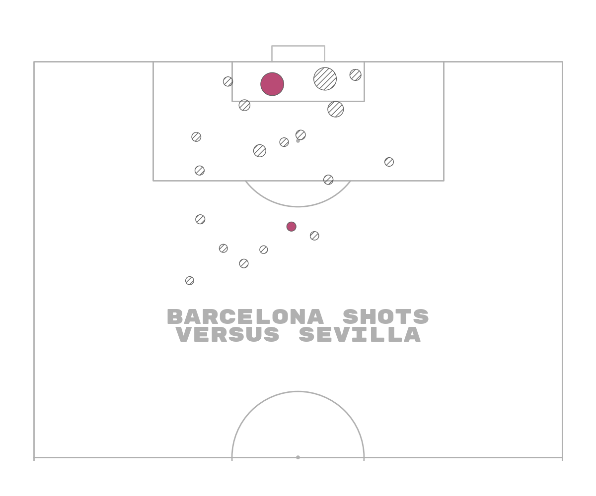
Shot map Barcelona
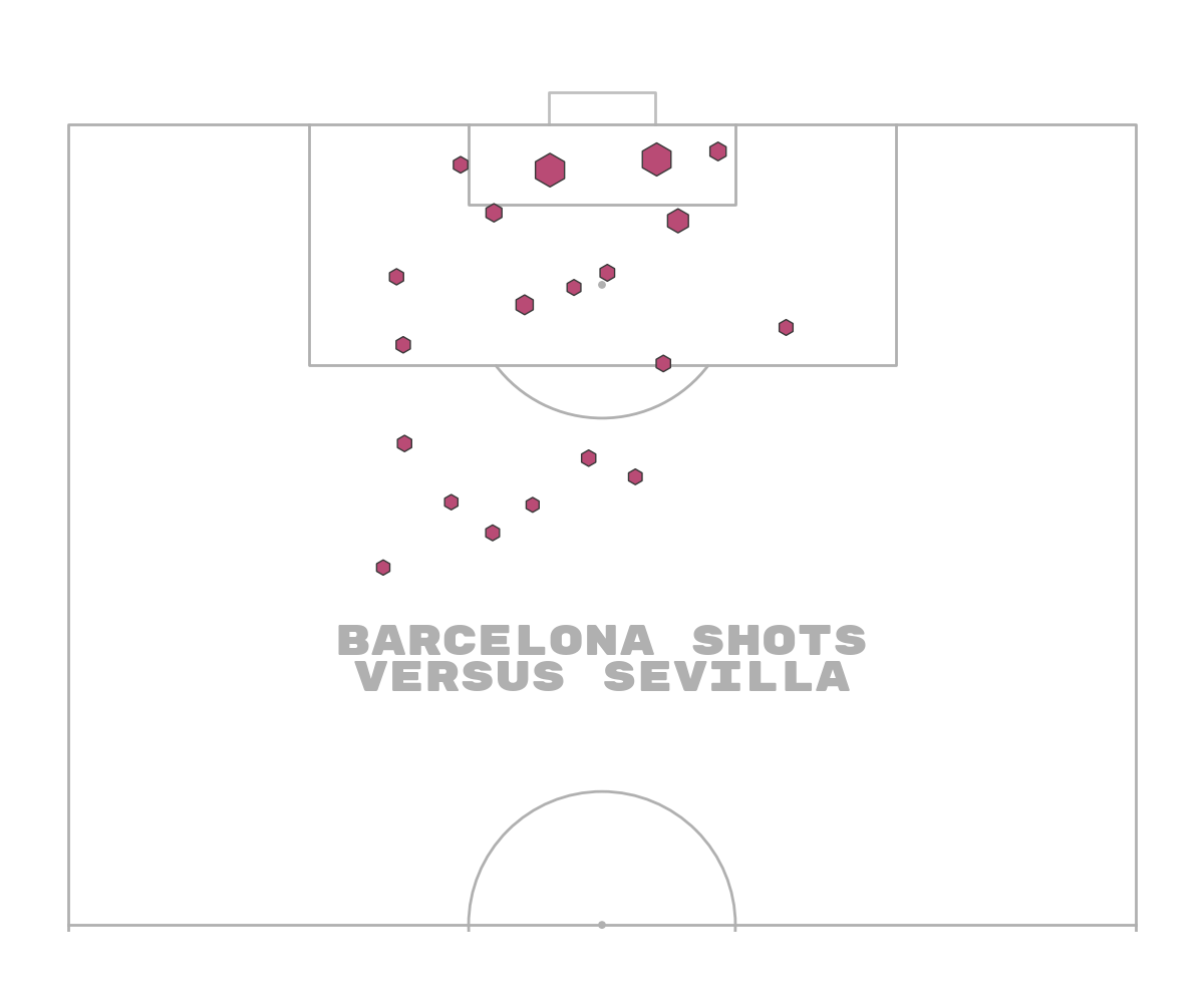
First let’s plot Barcelona’s shots with the scatter marker size varying by the expected goals amount. The maximum of 1 (100% expected chance of scoring) has been given size 1000 (points**2). By multiplying the expected goals amount by 900 and adding 100 we essentially get a size that varies between 100 and 1000. For choosing color schemes, I really like this website iWantHue.
pitch = VerticalPitch(pad_bottom=0.5,  # pitch extends slightly below halfway line
                      half=True,  # half of a pitch
                      goal_type='box',
                      goal_alpha=0.8)  # control the goal transparency
fig, ax = pitch.draw(figsize=(12, 10))
sc = pitch.scatter(df_shots_barca.x, df_shots_barca.y,
                   # size varies between 100 and 1000 (points squared)
                   s=(df_shots_barca.shot_statsbomb_xg * 900) + 100,
                   c='#b94b75',  # color for scatter in hex format
                   edgecolors='#383838',  # give the markers a charcoal border
                   # for other markers types see: https://matplotlib.org/api/markers_api.html
                   marker='h',
                   ax=ax)
txt = ax.text(x=40, y=80, s='Barcelona shots\nversus Sevilla',
              size=30,
              # here i am using a downloaded font from google fonts instead of passing a fontdict
              fontproperties=fm_rubik.prop, color=pitch.line_color,
              va='center', ha='center')
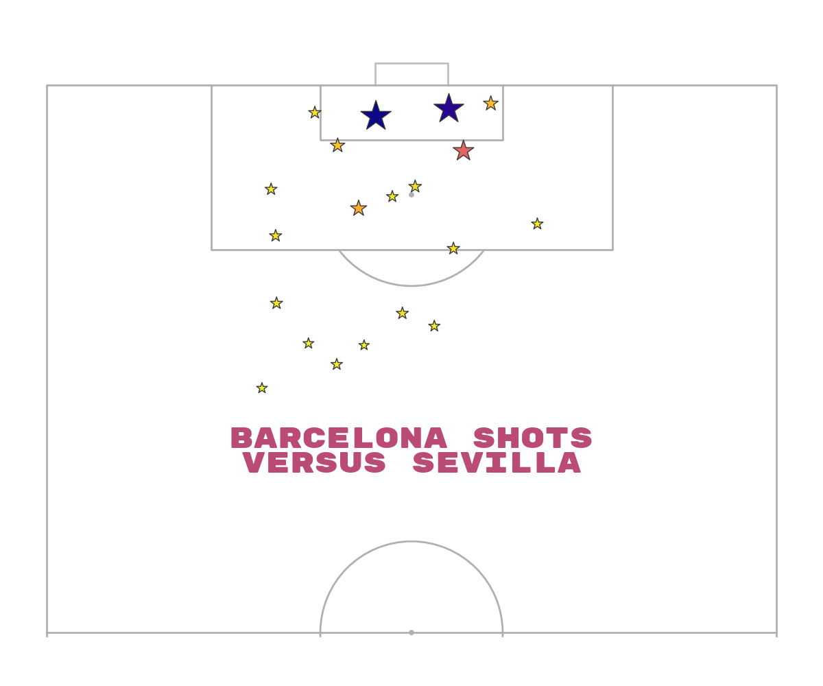
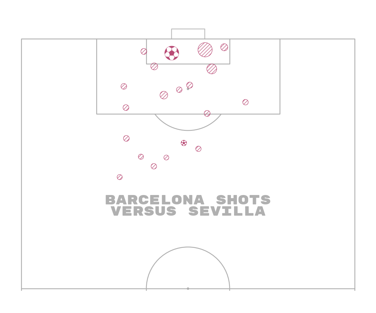
Shot map Barcelona using cmap
An alternative is to use colors to represent the quality of shots. In this example, we will also pass the expected goals to the c argument and use a matplotlib colormap to map the expected goals to colors
fig, ax = pitch.draw(figsize=(12, 10))
sc = pitch.scatter(df_shots_barca.x, df_shots_barca.y,
                   # size varies between 100 and 1900 (points squared)
                   s=(df_shots_barca.shot_statsbomb_xg * 1900) + 100,
                   cmap='plasma_r',  # reverse magma colormap so darker = higher expected goals
                   edgecolors='#383838',  # give the markers a charcoal border
                   c=df_shots_barca.shot_statsbomb_xg,  # color for scatter in hex format
                   # for other markers types see: https://matplotlib.org/api/markers_api.html
                   marker='*',
                   ax=ax)
txt = ax.text(x=40, y=80, s='Barcelona shots\nversus Sevilla',
              size=30,
              # here i am using a downloaded font from google fonts instead of passing a fontdict
              fontproperties=fm_rubik.prop, color='#b94b75',
              va='center', ha='center')
# comment below sets this as the thumbnail in the docs
# sphinx_gallery_thumbnail_path = 'gallery/pitch_plots/images/sphx_glr_plot_scatter_002'
Shot map Barcelona using cmap for edges
It’s possible to use cmaps for the edgecolors for emphasis by mapping the expected goals values to colors and using these as edgecolors. You could use the same technique to assign fewer colors to the scatter.
# get the cmap as 10 colors (n_colors can be anything)
cmap = colormaps.get_cmap('Greys')  # reversed plasma
N_COLORS = 10
cmap = cmap(np.linspace(0.5, 1, N_COLORS))  # from half-way (0.5) to end (1) of grey colormap
cmap = ListedColormap(cmap, name='Greys')
# convert the statsbomb xg to colors
edgecolors = cmap(df_shots_barca.shot_statsbomb_xg)

fig, ax = pitch.draw(figsize=(12, 10))
sc = pitch.scatter(df_shots_barca.x, df_shots_barca.y,
                   s=1000,
                   edgecolors=edgecolors,  # give the markers a charcoal border
                   linewidths=1.2,  # for fun making the edges slightly thicker
                   c='#b94b75',  # color for scatter in hex format
                   # for other markers types see: https://matplotlib.org/api/markers_api.html
                   marker='*',
                   ax=ax)
txt = ax.text(x=40, y=80, s='Barcelona shots\nversus Sevilla',
              size=30,
              # here i am using a downloaded font from google fonts instead of passing a fontdict
              fontproperties=fm_rubik.prop, color=pitch.line_color,
              va='center', ha='center')
Shot map Barcelona using transparency cmap
I included a helper function in mplsoccer to create a transparent cmap from either a color or a cmap. Here we create a cmap from a color (can use cmap=’viridis’ for example instead) and vary the transparency from 0.5 to 1 as the expected goals increase
cmap = create_transparent_cmap(color='#b94b75', n_segments=100, alpha_start=0.5, alpha_end=1)

fig, ax = pitch.draw(figsize=(12, 10))
sc = pitch.scatter(df_shots_barca.x, df_shots_barca.y,
                   # size varies between 100 and 1900 (points squared)
                   s=(df_shots_barca.shot_statsbomb_xg * 1900) + 100,
                   cmap=cmap,  # reverse magma colormap so darker = higher expected goals
                   edgecolors='#383838',  # give the markers a charcoal border
                   c=df_shots_barca.shot_statsbomb_xg,  # color for scatter in hex format
                   # for other markers types see: https://matplotlib.org/api/markers_api.html
                   marker='*',
                   ax=ax)
txt = ax.text(x=40, y=80, s='Barcelona shots\nversus Sevilla',
              size=30,
              # here i am using a downloaded font from google fonts instead of passing a fontdict
              fontproperties=fm_rubik.prop, color=pitch.line_color,
              va='center', ha='center')
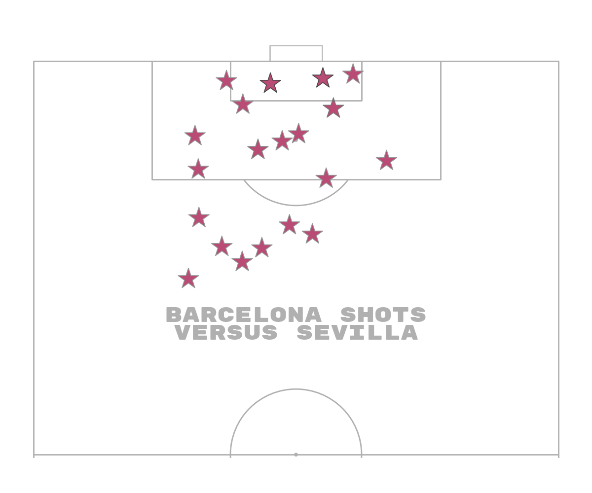
Shot map Barcelona using hatch
Another method popularized by @petermckeever. is to use hatch patterns to show where something was not-successful versus successful. There are lots of different hatch patterns. See set_hatch: https://matplotlib.org/stable/api/_as_gen/matplotlib.patches.Patch.html This is typically combined with the highlight-text package by @danzn1.
# filter goals / non-shot goals
df_goals_barca = df_shots_barca[df_shots_barca.outcome_name == 'Goal'].copy()
df_non_goal_shots_barca = df_shots_barca[df_shots_barca.outcome_name != 'Goal'].copy()

fig, ax = pitch.draw(figsize=(12, 10))

# plot non-goal shots with hatch
sc1 = pitch.scatter(df_non_goal_shots_barca.x, df_non_goal_shots_barca.y,
                    # size varies between 100 and 1900 (points squared)
                    s=(df_non_goal_shots_barca.shot_statsbomb_xg * 1900) + 100,
                    edgecolors='#606060',  # give the markers a charcoal border
                    c='None',  # no facecolor for the markers
                    hatch='///',  # the all important hatch (triple diagonal lines)
                    # for other markers types see: https://matplotlib.org/api/markers_api.html
                    marker='o',
                    ax=ax)

# plot goal shots with a color
sc2 = pitch.scatter(df_goals_barca.x, df_goals_barca.y,
                    # size varies between 100 and 1900 (points squared)
                    s=(df_goals_barca.shot_statsbomb_xg * 1900) + 100,
                    edgecolors='#606060',  # give the markers a charcoal border
                    c='#b94b75',  # color for scatter in hex format
                    # for other markers types see: https://matplotlib.org/api/markers_api.html
                    marker='o',
                    ax=ax)

txt = ax.text(x=40, y=80, s='Barcelona shots\nversus Sevilla',
              size=30,
              # here i am using a downloaded font from google fonts instead of passing a fontdict
              fontproperties=fm_rubik.prop, color=pitch.line_color,
              va='center', ha='center')
Shot map Barcelona using footballs
I also included a football marker in mplsoccer, which in this context could also be used to show goals/ non-goals
# filter goals / non-shot goals
df_goals_barca = df_shots_barca[df_shots_barca.outcome_name == 'Goal'].copy()
df_non_goal_shots_barca = df_shots_barca[df_shots_barca.outcome_name != 'Goal'].copy()

fig, ax = pitch.draw(figsize=(12, 10))

# plot non-goal shots with hatch
sc1 = pitch.scatter(df_non_goal_shots_barca.x, df_non_goal_shots_barca.y,
                    # size varies between 100 and 1900 (points squared)
                    s=(df_non_goal_shots_barca.shot_statsbomb_xg * 1900) + 100,
                    edgecolors='#b94b75',  # give the markers a charcoal border
                    c='None',  # no facecolor for the markers
                    hatch='///',  # the all important hatch (triple diagonal lines)
                    # for other markers types see: https://matplotlib.org/api/markers_api.html
                    marker='o',
                    ax=ax)

# plot goal shots with a football marker
# 'edgecolors' sets the color of the pentagons and edges, 'c' sets the color of the hexagons
sc2 = pitch.scatter(df_goals_barca.x, df_goals_barca.y,
                    # size varies between 100 and 1900 (points squared)
                    s=(df_goals_barca.shot_statsbomb_xg * 1900) + 100,
                    edgecolors='#b94b75',
                    linewidths=0.6,
                    c='white',
                    marker='football',
                    ax=ax)

txt = ax.text(x=40, y=80, s='Barcelona shots\nversus Sevilla',
              size=30,
              # here i am using a downloaded font from google fonts instead of passing a fontdict
              fontproperties=fm_rubik.prop, color=pitch.line_color,
              va='center', ha='center')
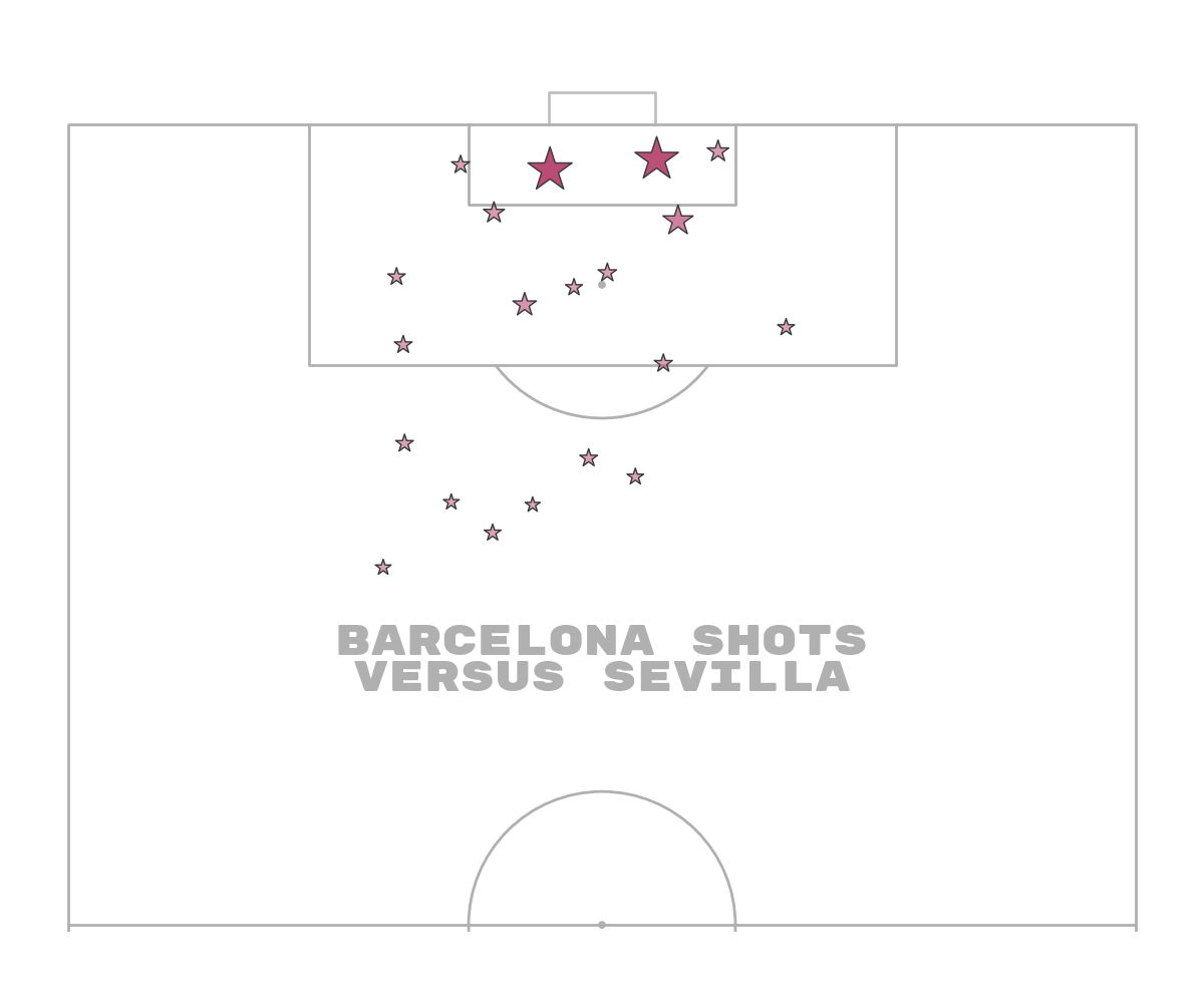
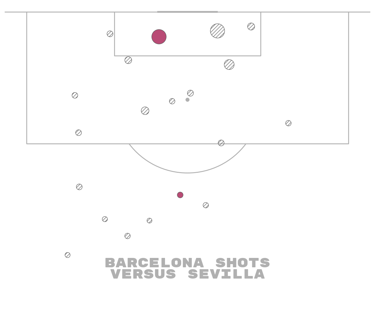
Cropping to important areas
One under-used technique is to crop the pitch edges where there is likely to be fewer shots. If you look at the StatsBomb shot maps this is a subtle technique they use. It means you reduce the amount of white space and you zoom into the areas where more shots are taken.
The disadvantage of this approach is that sometimes people misinterpret the pitch and think the areas towards the edges are the edges of the pitch. You might also miss some shots near the half-way line.
pitch = VerticalPitch(pad_top=0.5,  # only a small amount of space at the top of the pitch
                      pad_bottom=-20,  # reduce the area displayed at the bottom of the pitch
                      pad_left=-15,  # reduce the area displayed on the left of the pitch
                      pad_right=-15,  # reduce the area displayed on the right of the pitch
                      half=True,  # half of a pitch
                      goal_type='line')

# filter goals / non-shot goals
df_goals_barca = df_shots_barca[df_shots_barca.outcome_name == 'Goal'].copy()
df_non_goal_shots_barca = df_shots_barca[df_shots_barca.outcome_name != 'Goal'].copy()

fig, ax = pitch.draw(figsize=(12, 10))

# plot non-goal shots with hatch
sc1 = pitch.scatter(df_non_goal_shots_barca.x, df_non_goal_shots_barca.y,
                    # size varies between 100 and 1900 (points squared)
                    s=(df_non_goal_shots_barca.shot_statsbomb_xg * 1900) + 100,
                    edgecolors='#606060',  # give the markers a charcoal border
                    c='None',  # no facecolor for the markers
                    hatch='///',  # the all important hatch (triple diagonal lines)
                    # for other markers types see: https://matplotlib.org/api/markers_api.html
                    marker='o',
                    ax=ax)

# plot goal shots with a color
sc2 = pitch.scatter(df_goals_barca.x, df_goals_barca.y,
                    # size varies between 100 and 1900 (points squared)
                    s=(df_goals_barca.shot_statsbomb_xg * 1900) + 100,
                    edgecolors='#606060',  # give the markers a charcoal border
                    c='#b94b75',  # color for scatter in hex format
                    # for other markers types see: https://matplotlib.org/api/markers_api.html
                    marker='o',
                    ax=ax)

txt = ax.text(x=40, y=85, s='Barcelona shots\nversus Sevilla',
              size=30,
              # here i am using a downloaded font from google fonts instead of passing a fontdict
              fontproperties=fm_rubik.prop, color=pitch.line_color,
              va='center', ha='center')
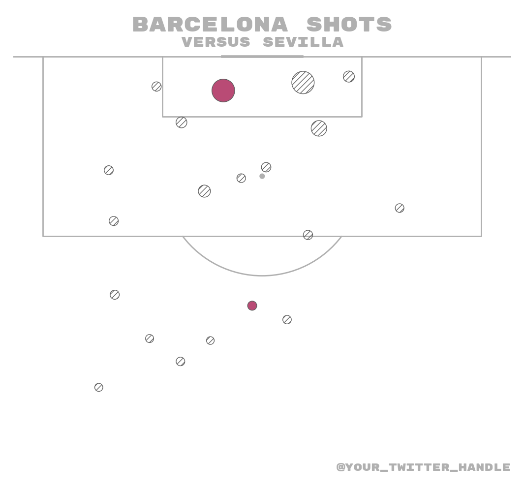
Plot the chart again with a title
We will use mplsoccer’s grid function to plot a pitch with a title and endnote axes.
fig, axs = pitch.grid(figheight=10, title_height=0.08, endnote_space=0,
                      # Turn off the endnote/title axis. I usually do this after
                      # I am happy with the chart layout and text placement
                      axis=False,
                      title_space=0, grid_height=0.82, endnote_height=0.05)

# plot non-goal shots with hatch
sc1 = pitch.scatter(df_non_goal_shots_barca.x, df_non_goal_shots_barca.y,
                    # size varies between 100 and 1900 (points squared)
                    s=(df_non_goal_shots_barca.shot_statsbomb_xg * 1900) + 100,
                    edgecolors='#606060',  # give the markers a charcoal border
                    c='None',  # no facecolor for the markers
                    hatch='///',  # the all important hatch (triple diagonal lines)
                    # for other markers types see: https://matplotlib.org/api/markers_api.html
                    marker='o',
                    ax=axs['pitch'])

# plot goal shots with a color
sc2 = pitch.scatter(df_goals_barca.x, df_goals_barca.y,
                    # size varies between 100 and 1900 (points squared)
                    s=(df_goals_barca.shot_statsbomb_xg * 1900) + 100,
                    edgecolors='#606060',  # give the markers a charcoal border
                    c='#b94b75',  # color for scatter in hex format
                    # for other markers types see: https://matplotlib.org/api/markers_api.html
                    marker='o',
                    ax=axs['pitch'])

# endnote text
axs['endnote'].text(1, 0.5, '@your_twitter_handle', color=pitch.line_color,
                    va='center', ha='right', fontsize=15,
                    fontproperties=fm_rubik.prop)

# title text
title1 = axs['title'].text(0.5, 0.7, "Barcelona shots", color=pitch.line_color,
                           va='center', ha='center', fontproperties=fm_rubik.prop, fontsize=30)
title2 = axs['title'].text(0.5, 0.25, "versus Sevilla", color=pitch.line_color,
                           va='center', ha='center', fontproperties=fm_rubik.prop, fontsize=20)
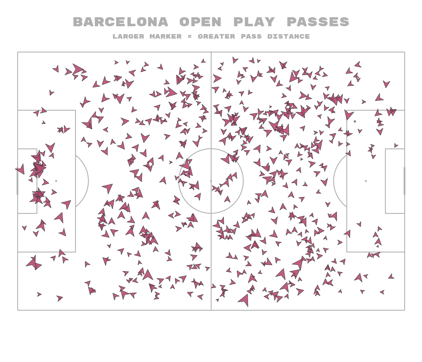
Rotated markers
I also included a method for rotating markers in mplsoccer.
Warning: The rotation angle is in degrees and assumes the original marker is pointing upwards ↑. If it’s not you will have to modify the rotation degrees. Rotates the marker in degrees, clockwise. 0 degrees is facing the direction of play (left to right). In a horizontal pitch, 0 degrees is this way →, in a vertical pitch, 0 degrees is this way ↑
We are going to plot pass data as an arrowhead marker with the arrow facing in the direction of the pass. The marker size is going to relate to the pass distance, so larger markers mean the pass was longer.
pitch = Pitch()
fig, ax = pitch.draw(figsize=(14, 12))
angle, distance = pitch.calculate_angle_and_distance(df_pass_barca.x, df_pass_barca.y,
                                                     df_pass_barca.end_x, df_pass_barca.end_y,
                                                     degrees=True)
sc = pitch.scatter(df_pass_barca.x, df_pass_barca.y, rotation_degrees=angle,
                   c='#b94b75',  # color for scatter in hex format
                   edgecolors='#383838', alpha=0.9,
                   s=(distance / distance.max()) * 900, ax=ax, marker=arrowhead_marker)
title1 = fig.text(x=0.5, y=0.94, s='Barcelona Open play passes', va='center', ha='center',
                  size=30, color=pitch.line_color,
                  fontproperties=fm_rubik.prop, )
title2 = fig.text(x=0.5, y=0.9, s='Larger marker = greater pass distance', va='center',
                  ha='center', size=15, color=pitch.line_color, fontproperties=fm_rubik.prop)

plt.show()  # If you are using a Jupyter notebook you do not need this line
Total running time of the script: (0 minutes 1.035 seconds)