Note
Go to the end to download the full example code.
FBRef Touches
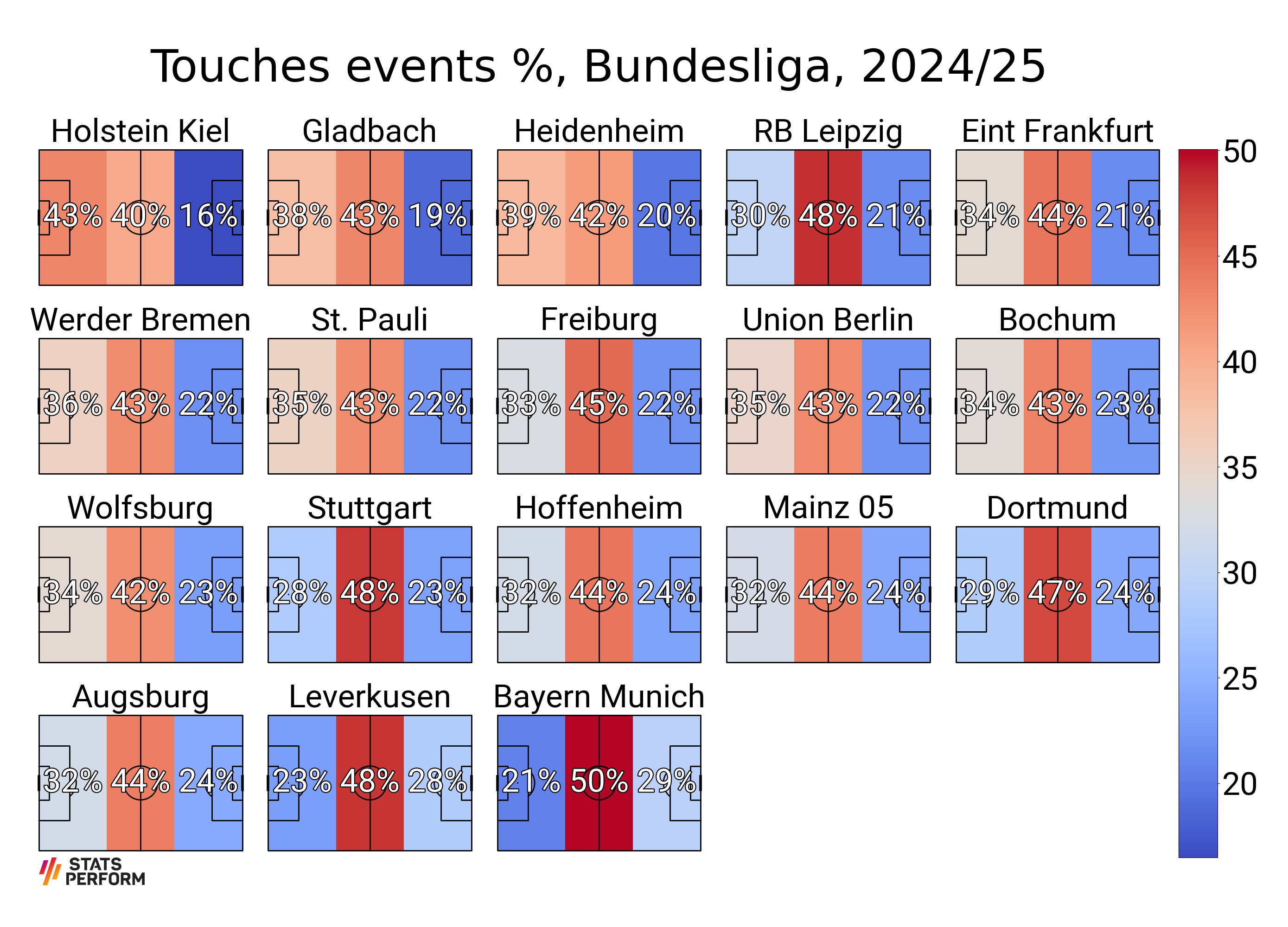
This example shows how to scrape touches events from FBRef.com and plot them as a heatmap.
from urllib.request import urlopen, Request

import matplotlib.patheffects as path_effects
import matplotlib.pyplot as plt
import pandas as pd
from PIL import Image

from mplsoccer import Pitch, FontManager, add_image
For illustrative purposes we are showing some data from the 2024-25 Bundesliga season. The data is from the fantastic resource https://fbref.com/.
df = pd.DataFrame({'Squad': ['Augsburg', 'Bayern Munich', 'Bochum',
                             'Dortmund', 'Eint Frankfurt', 'Freiburg',
                             'Gladbach', 'Heidenheim', 'Hoffenheim',
                             'Holstein Kiel', 'Leverkusen', 'Mainz 05',
                             'RB Leipzig', 'St. Pauli', 'Stuttgart',
                             'Union Berlin', 'Werder Bremen', 'Wolfsburg'],
                   'Def 3rd': [6126, 6130, 6257, 6972, 7332, 6656, 8283,
                               7356, 6644, 7924, 5876, 6705, 6793, 6816,
                               6719, 6285, 7701, 6603],
                   'Mid 3rd': [8404, 14825, 8021, 11525, 9549, 9166, 9361,
                               7915, 9219, 7386, 12171, 9124, 10962, 8232,
                               11421, 7721, 9226, 8190],
                   'Att 3rd': [4701, 8664, 4198, 5921, 4619, 4504, 4035,
                               3789, 4904, 3022, 7188, 5015, 4856, 4244,
                               5572, 3997, 4721, 4491],
                  })
Get the league average percentages
touches_cols = ['Def 3rd', 'Mid 3rd', 'Att 3rd']
df_total = pd.DataFrame(df[touches_cols].sum())
df_total.columns = ['total']
df_total = df_total.T
df_total = df_total.divide(df_total.sum(axis=1), axis=0) * 100
Calculate the percentages for each team and sort so that the teams make the most touches are last
df[touches_cols] = df[touches_cols].divide(df[touches_cols].sum(axis=1), axis=0) * 100.
df.sort_values(['Att 3rd', 'Def 3rd'], ascending=[True, False], inplace=True)
Get Stats Perform’s logo and Fonts
SP_LOGO_URL = ('https://upload.wikimedia.org/wikipedia/commons/d/d5/StatsPerform_Logo_Primary_01.png')
request = Request(SP_LOGO_URL)
request.add_header('User-Agent', 'mplsoccerdocs (https://mplsoccer.rtfd.io)')
sp_logo = Image.open(urlopen(request))

# a FontManager object for using a google font (default Robotto)
fm = FontManager()
# path effects
path_eff = [path_effects.Stroke(linewidth=3, foreground='black'),
            path_effects.Normal()]
Plot the percentages
# setup a mplsoccer pitch
pitch = Pitch(line_zorder=2, line_color='black', pad_top=20)

# mplsoccer calculates the binned statistics usually from raw locations, such as touches events
# for this example we will create a binned statistic dividing
# the pitch into thirds for one point (0, 0)
# we will fill this in a loop later with each team's statistics from the dataframe
bin_statistic = pitch.bin_statistic([0], [0], statistic='count', bins=(3, 1))

GRID_HEIGHT = 0.8
CBAR_WIDTH = 0.03
fig, axs = pitch.grid(nrows=4, ncols=5, figheight=20,
                      # leaves some space on the right hand side for the colorbar
                      grid_width=0.88, left=0.025,
                      endnote_height=0.03, endnote_space=0,
                      # Turn off the endnote/title axis. I usually do this after
                      # I am happy with the chart layout and text placement
                      axis=False,
                      title_space=0.02, title_height=0.06, grid_height=GRID_HEIGHT)
fig.set_facecolor('white')

teams = df['Squad'].values
vmin = df[touches_cols].min().min()  # we normalise the heatmaps with the min / max values
vmax = df[touches_cols].max().max()
for i, ax in enumerate(axs['pitch'].flat[:len(teams)]):
    # the top of the pitch is zero
    # plot the title half way between zero and -20 (the top padding)
    ax.text(60, -10, teams[i],
            ha='center', va='center', fontsize=50,
            fontproperties=fm.prop)

    # fill in the bin statistics from df and plot the heatmap
    bin_statistic['statistic'] = df.loc[df.Squad == teams[i], touches_cols].values
    heatmap = pitch.heatmap(bin_statistic, ax=ax, cmap='coolwarm', vmin=vmin, vmax=vmax)
    annotate = pitch.label_heatmap(bin_statistic, color='white', fontproperties=fm.prop,
                                   path_effects=path_eff, fontsize=50, ax=ax,
                                   str_format='{0:.0f}%', ha='center', va='center')

# if its the Bundesliga remove the two spare pitches
if len(teams) == 18:
    for ax in axs['pitch'][-1, 3:]:
        ax.remove()

# add cbar axes
cbar_bottom = axs['pitch'][-1, 0].get_position().y0
cbar_left = axs['pitch'][0, -1].get_position().x1 + 0.01
ax_cbar = fig.add_axes((cbar_left, cbar_bottom, CBAR_WIDTH,
                        # take a little bit off the height because of padding
                        GRID_HEIGHT - 0.036))
cbar = plt.colorbar(heatmap, cax=ax_cbar)
for label in cbar.ax.get_yticklabels():
    label.set_fontproperties(fm.prop)
    label.set_fontsize(50)

# title and endnote
add_image(sp_logo, fig,
          left=axs['endnote'].get_position().x0,
          bottom=axs['endnote'].get_position().y0,
          height=axs['endnote'].get_position().height)
title = axs['title'].text(0.5, 0.5, 'Touches events %, Bundesliga, 2024/25',
                          ha='center', va='center', fontsize=70)
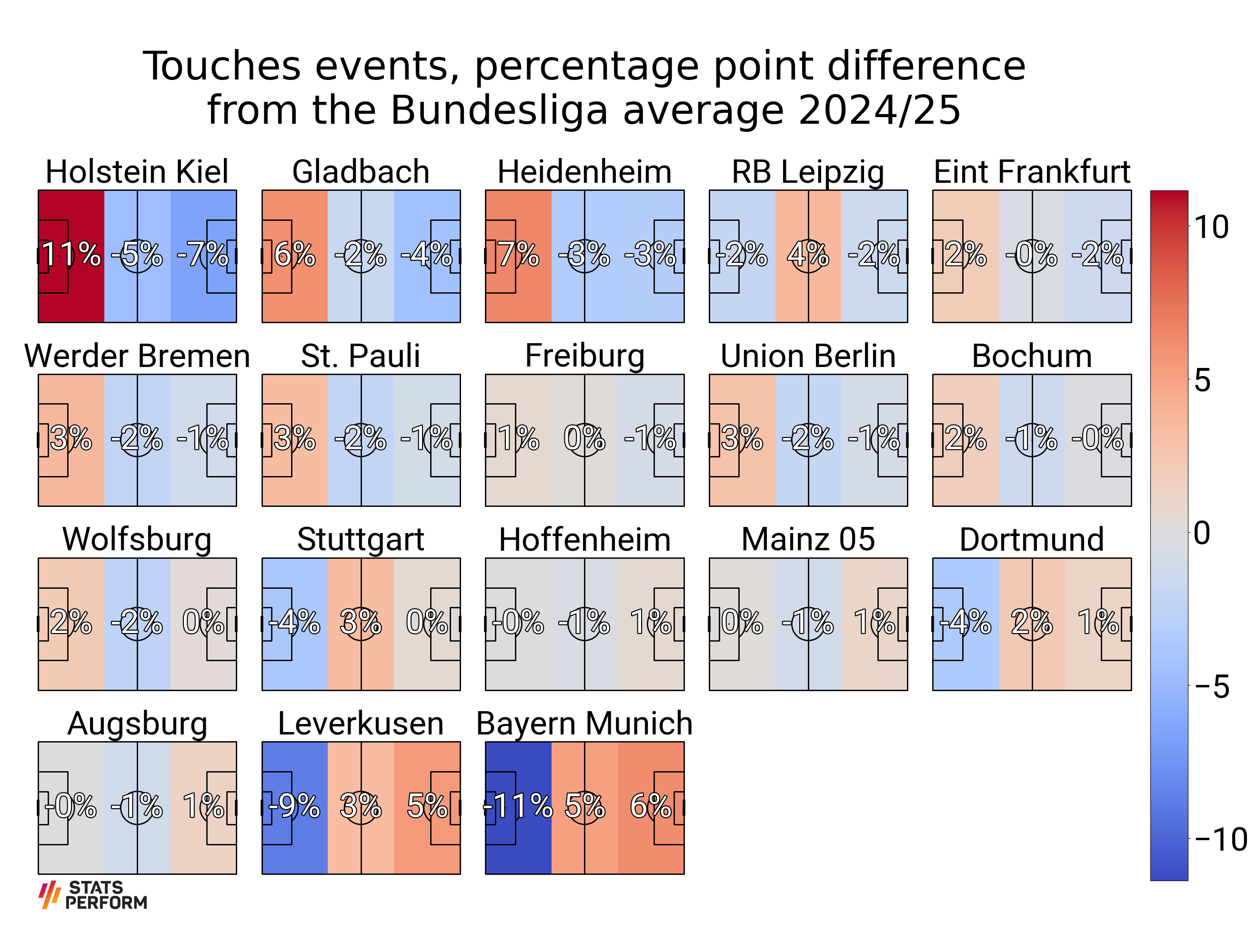
Plot the percentage point difference
# Calculate the percentage point difference from the league average
df[touches_cols] = df[touches_cols].values - df_total.values

GRID_HEIGHT = 0.76
fig, axs = pitch.grid(nrows=4, ncols=5, figheight=20,
                      # leaves some space on the right hand side for the colorbar
                      grid_width=0.88, left=0.025,
                      endnote_height=0.03, endnote_space=0,
                      # Turn off the endnote/title axis. I usually do this after
                      # I am happy with the chart layout and text placement
                      axis=False,
                      title_space=0.02, title_height=0.1, grid_height=GRID_HEIGHT)
fig.set_facecolor('white')

teams = df['Squad'].values
vmin = df[touches_cols].min().min()  # we normalise the heatmaps with the min / max values
vmax = df[touches_cols].max().max()

for i, ax in enumerate(axs['pitch'].flat[:len(teams)]):
    # the top of the pitch is zero
    # plot the title half way between zero and -20 (the top padding)
    ax.text(60, -10, teams[i], ha='center', va='center', fontsize=50, fontproperties=fm.prop)

    # fill in the bin statistics from df and plot the heatmap
    bin_statistic['statistic'] = df.loc[df.Squad == teams[i], touches_cols].values
    heatmap = pitch.heatmap(bin_statistic, ax=ax, cmap='coolwarm', vmin=vmin, vmax=vmax)
    annotate = pitch.label_heatmap(bin_statistic, color='white', fontproperties=fm.prop,
                                   path_effects=path_eff, str_format='{0:.0f}%', fontsize=50,
                                   ax=ax, ha='center', va='center')

# if its the Bundesliga remove the two spare pitches
if len(teams) == 18:
    for ax in axs['pitch'][-1, 3:]:
        ax.remove()

# add cbar axes
cbar_bottom = axs['pitch'][-1, 0].get_position().y0
cbar_left = axs['pitch'][0, -1].get_position().x1 + 0.01
ax_cbar = fig.add_axes((cbar_left, cbar_bottom, CBAR_WIDTH,
                        # take a little bit off the height because of padding
                        GRID_HEIGHT - 0.035))
cbar = plt.colorbar(heatmap, cax=ax_cbar)
for label in cbar.ax.get_yticklabels():
    label.set_fontproperties(fm.prop)
    label.set_fontsize(50)

# title and endnote
add_image(sp_logo, fig,
          left=axs['endnote'].get_position().x0,
          bottom=axs['endnote'].get_position().y0,
          height=axs['endnote'].get_position().height)
TITLE = 'Touches events, percentage point difference\nfrom the Bundesliga average 2024/25'
title = axs['title'].text(0.5, 0.5, TITLE, ha='center', va='center', fontsize=60)

plt.show()  # If you are using a Jupyter notebook you do not need this line
Total running time of the script: (0 minutes 1.812 seconds)