Note
Go to the end to download the full example code.
Jointgrid
Inspired by the Seaborn jointgrid and @n_mondon charts, jointgrid gives a handy way to put marginal axis on each side of the pitch.
import numpy as np
import pandas as pd
import seaborn as sns
from matplotlib import colormaps
import matplotlib.pyplot as plt

from mplsoccer import Pitch, VerticalPitch, Sbopen, FontManager

# get data for a Sevilla versus Barcelona match with a high amount of shots
parser = Sbopen()
df, related, freeze, tactics = parser.event(9860)

# setup the mplsoccer StatsBomb Pitches
# note not much padding around the pitch so the marginal axis are tight to the pitch
# if you are using a different goal type you will need to increase the padding to see the goals
pitch = Pitch(pad_top=0.05, pad_right=0.05, pad_bottom=0.05, pad_left=0.05, line_zorder=2)
vertical_pitch = VerticalPitch(half=True, pad_top=0.05, pad_right=0.05, pad_bottom=0.05,
                               pad_left=0.05, line_zorder=2)

# setup a mplsoccer FontManager to download google fonts (Roboto-Regular / SigmarOne-Regular)
fm = FontManager()
fm_rubik = FontManager('https://raw.githubusercontent.com/google/fonts/main/ofl/rubikmonoone/'
                       'RubikMonoOne-Regular.ttf')
Subset the shots for each team and move Barcelona’s shots to the other side of the pitch.
# subset the shots
df_shots = df[df.type_name == 'Shot'].copy()

# subset the shots for each team
team1, team2 = df_shots.team_name.unique()
df_team1 = df_shots[df_shots.team_name == team1].copy()
df_team2 = df_shots[df_shots.team_name == team2].copy()

# Usually in football, the data is collected so the attacking direction is left to right.
# We can shift the coordinates via: new_x_coordinate = right_side - old_x_coordinate
# This is helpful for having one team shots on the left of the pitch and the other on the right
df_team1['x'] = pitch.dim.right - df_team1.x
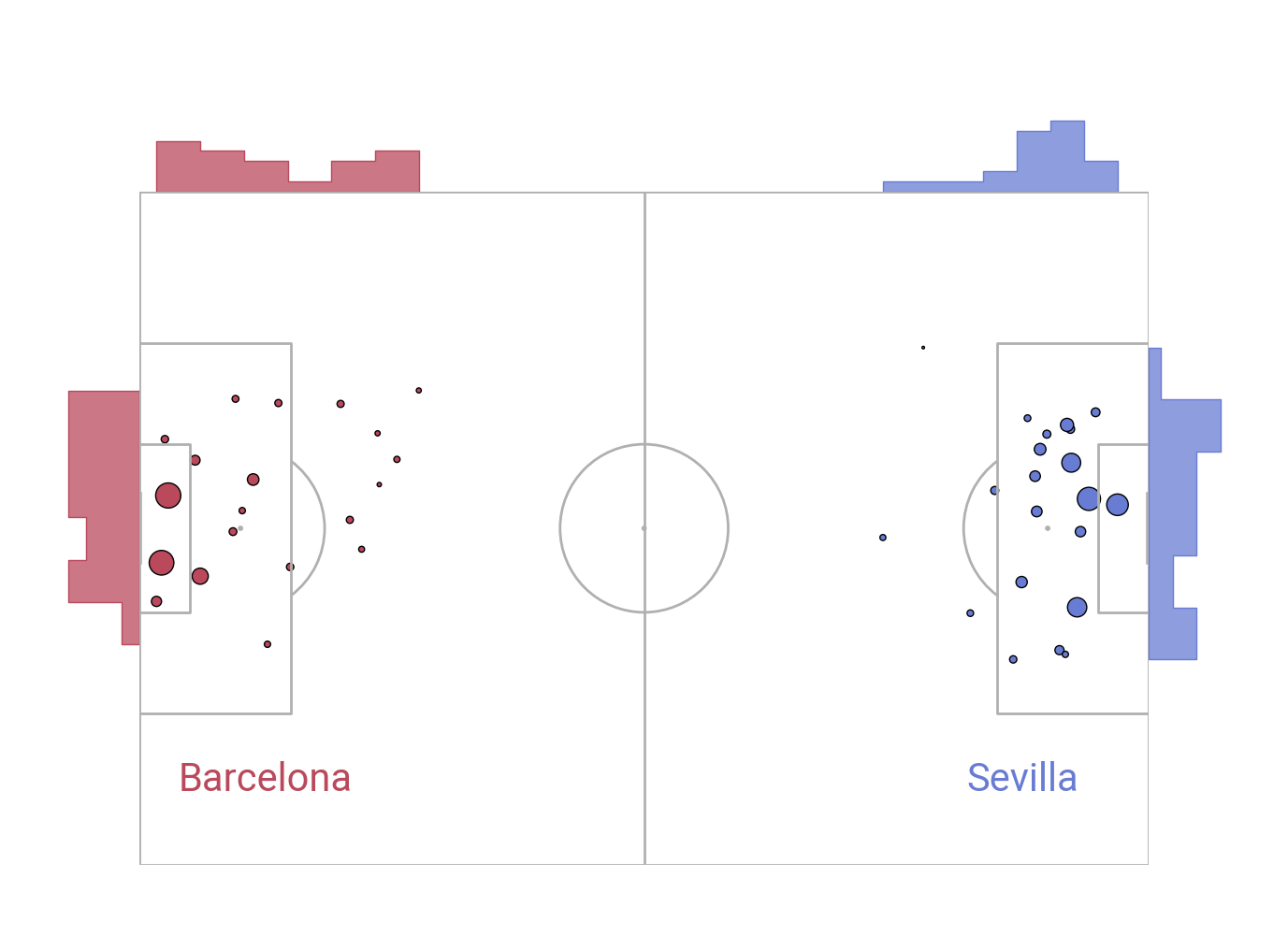
Plotting a standard shot map with step charts
fig, axs = pitch.jointgrid(figheight=10,  # the figure is 10 inches high
                           left=None,  # joint grid center-aligned
                           bottom=0.075,  # grid starts 7.5% in from the bottom of the figure
                           marginal=0.1,  # marginal axes heights are 10% of grid height
                           space=0,  # 0% of the grid height reserved for space between axes
                           grid_width=0.9,  # the grid width takes up 90% of the figure width
                           title_height=0,  # plot without a title axes
                           axis=False,  # turn off title/ endnote/ marginal axes
                           endnote_height=0,  # plot without an endnote axes
                           grid_height=0.8)  # grid takes up 80% of the figure height
# we plot a usual scatter plot but the scatter size is based on expected goals
# note that the size is the expected goals * 700
# so any shots with an expected goals = 1 would take a size of 700 (points**2)
sc_team1 = pitch.scatter(df_team1.x, df_team1.y, s=df_team1.shot_statsbomb_xg * 700,
                         ec='black', color='#ba495c', ax=axs['pitch'])
sc_team2 = pitch.scatter(df_team2.x, df_team2.y, s=df_team2.shot_statsbomb_xg * 700,
                         ec='black', color='#697cd4', ax=axs['pitch'])
# (step) histograms on each of the left, top, and right marginal axes
team1_hist_y = sns.histplot(y=df_team1.y, ax=axs['left'], element='step', color='#ba495c')
team1_hist_x = sns.histplot(x=df_team1.x, ax=axs['top'], element='step', color='#ba495c')
team2_hist_x = sns.histplot(x=df_team2.x, ax=axs['top'], element='step', color='#697cd4')
team2_hist_y = sns.histplot(y=df_team2.y, ax=axs['right'], element='step', color='#697cd4')
txt1 = axs['pitch'].text(x=15, y=70, s=team1, fontproperties=fm.prop, color='#ba495c',
                         ha='center', va='center', fontsize=30)
txt2 = axs['pitch'].text(x=105, y=70, s=team2, fontproperties=fm.prop, color='#697cd4',
                         ha='center', va='center', fontsize=30)
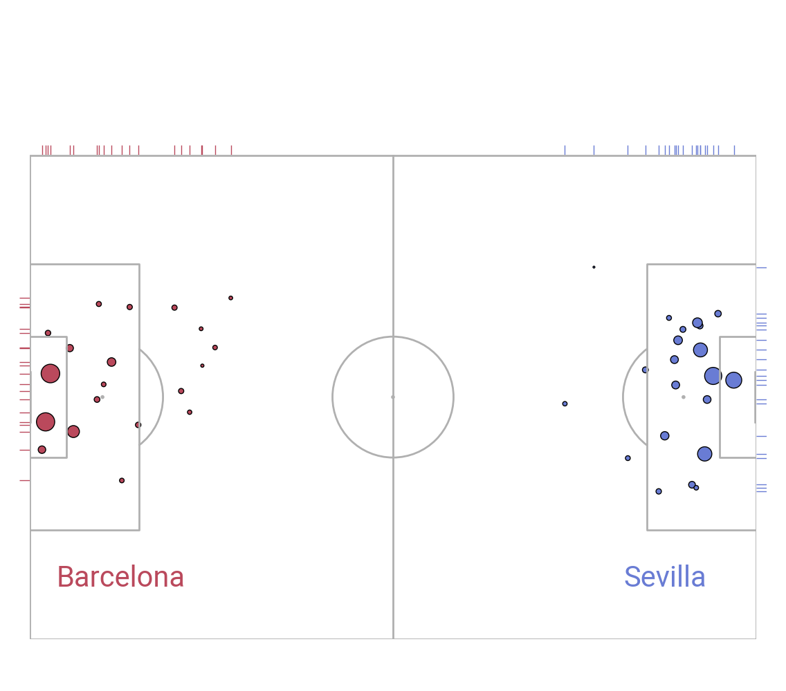
Plotting a standard shot map with rug plots
# decreased the marginal height as rug plots are only lines,
# we don't need as much space taken up by the marginal axes
fig, axs = pitch.jointgrid(figheight=10, left=None, bottom=0.075, marginal=0.02,
                           axis=False,  # turn off title/ endnote/ marginal axes
                           # plot without title/ endnote axes
                           endnote_height=0, title_height=0)
sc_team1 = pitch.scatter(df_team1.x, df_team1.y, s=df_team1.shot_statsbomb_xg * 700,
                         ec='black', color='#ba495c', ax=axs['pitch'])
sc_team2 = pitch.scatter(df_team2.x, df_team2.y, s=df_team2.shot_statsbomb_xg * 700,
                         ec='black', color='#697cd4', ax=axs['pitch'])
# note height=1 means that the whole of the marginal axes are taken up by the rugplots
team1_rug_y = sns.rugplot(y=df_team1.y, ax=axs['left'], color='#ba495c', height=1)
team1_rug_y = sns.rugplot(y=df_team2.y, ax=axs['right'], color='#697cd4', height=1)
team1_rug_x = sns.rugplot(x=df_team1.x, ax=axs['top'], color='#ba495c', height=1)
team2_rug_x = sns.rugplot(x=df_team2.x, ax=axs['top'], color='#697cd4', height=1)
txt1 = axs['pitch'].text(x=15, y=70, s=team1, fontproperties=fm.prop, color='#ba495c',
                         ha='center', va='center', fontsize=30)
txt2 = axs['pitch'].text(x=105, y=70, s=team2, fontproperties=fm.prop, color='#697cd4',
                         ha='center', va='center', fontsize=30)
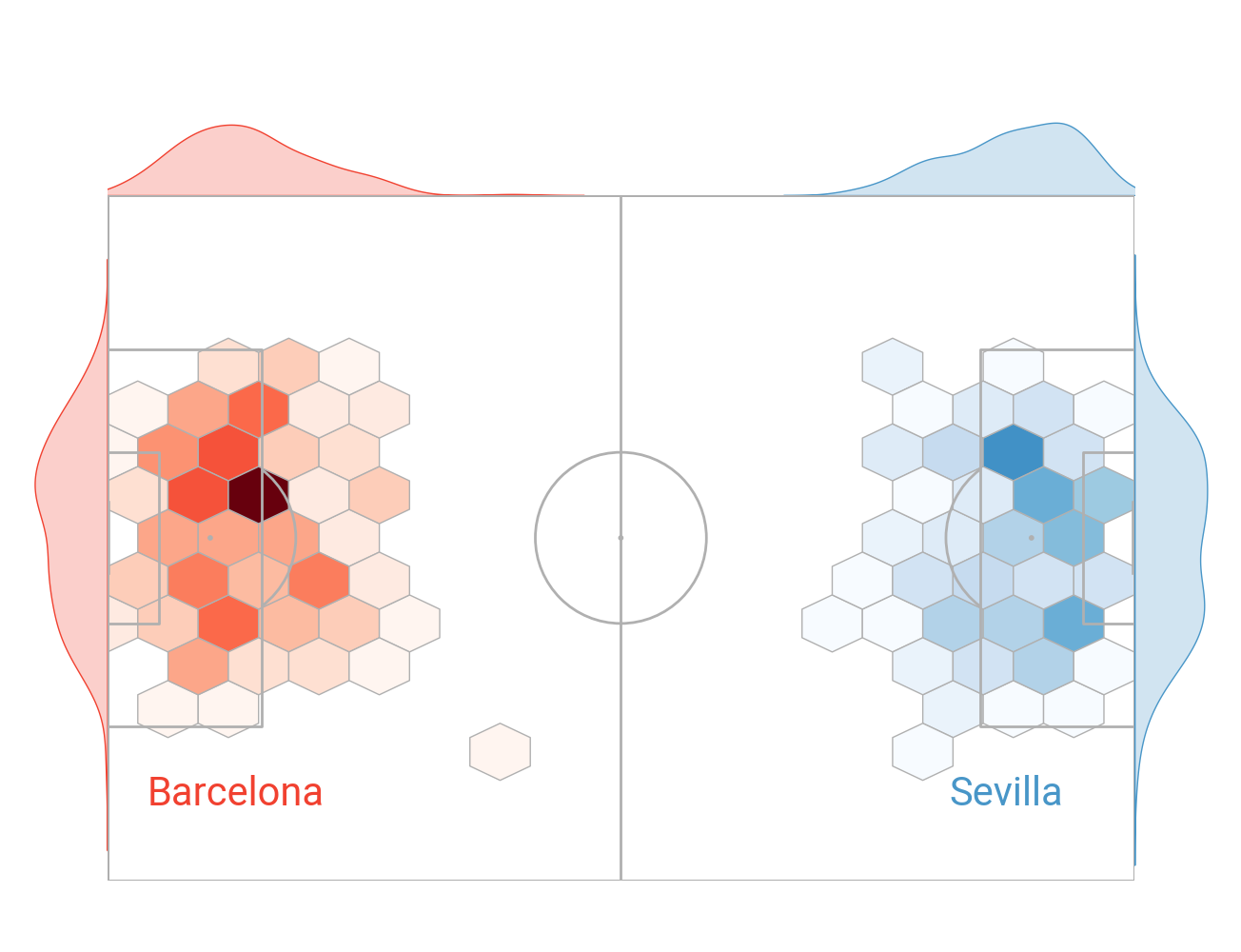
Get more shot data for additional games
# sevilla versus barcelona 2014/2015 to 2019/2020
match_files = [265835, 266142, 265839, 266989, 266280, 9673, 9860, 16029, 16190, 303473, 303674]
df = pd.concat([parser.event(file)[0] for file in match_files])  # 0 index is the event file

# subset the shots
df_shots = df[df.type_name == 'Shot'].copy()

# subset the shots for each team
team1, team2 = df_shots.team_name.unique()
df_team1 = df_shots[df_shots.team_name == team1].copy().reset_index(drop=True)
df_team2 = df_shots[df_shots.team_name == team2].copy().reset_index(drop=True)

# move the team1 coordinate to the left hand side
df_team1['x'] = pitch.dim.right - df_team1.x
Get colors
We are using Reds and Blues colormaps below and select a color just over half way (60%) through the colormap for use in the charts.
red = colormaps.get_cmap('Reds')(np.linspace(0, 1, 100))[60]
blue = colormaps.get_cmap('Blues')(np.linspace(0, 1, 100))[60]
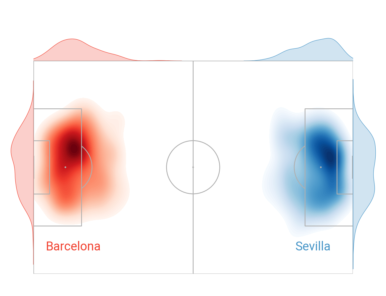
Hexbin shot map with kdeplot marginal axes
fig, axs = pitch.jointgrid(figheight=10, left=None, bottom=0.075, grid_height=0.8,
                           axis=False,  # turn off title/ endnote/ marginal axes
                           # plot without endnote/ title axes
                           endnote_height=0, title_height=0)
# plot the hexbins
hex1 = pitch.hexbin(df_team1.x, df_team1.y, ax=axs['pitch'],
                    edgecolors=pitch.line_color, cmap='Reds')
hex2 = pitch.hexbin(df_team2.x, df_team2.y, ax=axs['pitch'],
                    edgecolors=pitch.line_color, cmap='Blues')
# normalize the values so the colors depend on the minimum/ value for both teams
# this ensures that darker colors mean more shots relative to both teams
vmin = min(hex1.get_array().min(), hex2.get_array().min())
vmax = max(hex1.get_array().max(), hex2.get_array().max())
hex1.set_clim(vmin=vmin, vmax=vmax)
hex2.set_clim(vmin=vmin, vmax=vmax)
# plot kdeplots on the marginals
team1_hist_y = sns.kdeplot(y=df_team1.y, ax=axs['left'], color=red, fill=True)
team1_hist_x = sns.kdeplot(x=df_team1.x, ax=axs['top'], color=red, fill=True)
team2_hist_x = sns.kdeplot(x=df_team2.x, ax=axs['top'], color=blue, fill=True)
team2_hist_y = sns.kdeplot(y=df_team2.y, ax=axs['right'], color=blue, fill=True)
txt1 = axs['pitch'].text(x=15, y=70, s=team1, fontproperties=fm.prop, color=red,
                         ha='center', va='center', fontsize=30)
txt2 = axs['pitch'].text(x=105, y=70, s=team2, fontproperties=fm.prop, color=blue,
                         ha='center', va='center', fontsize=30)
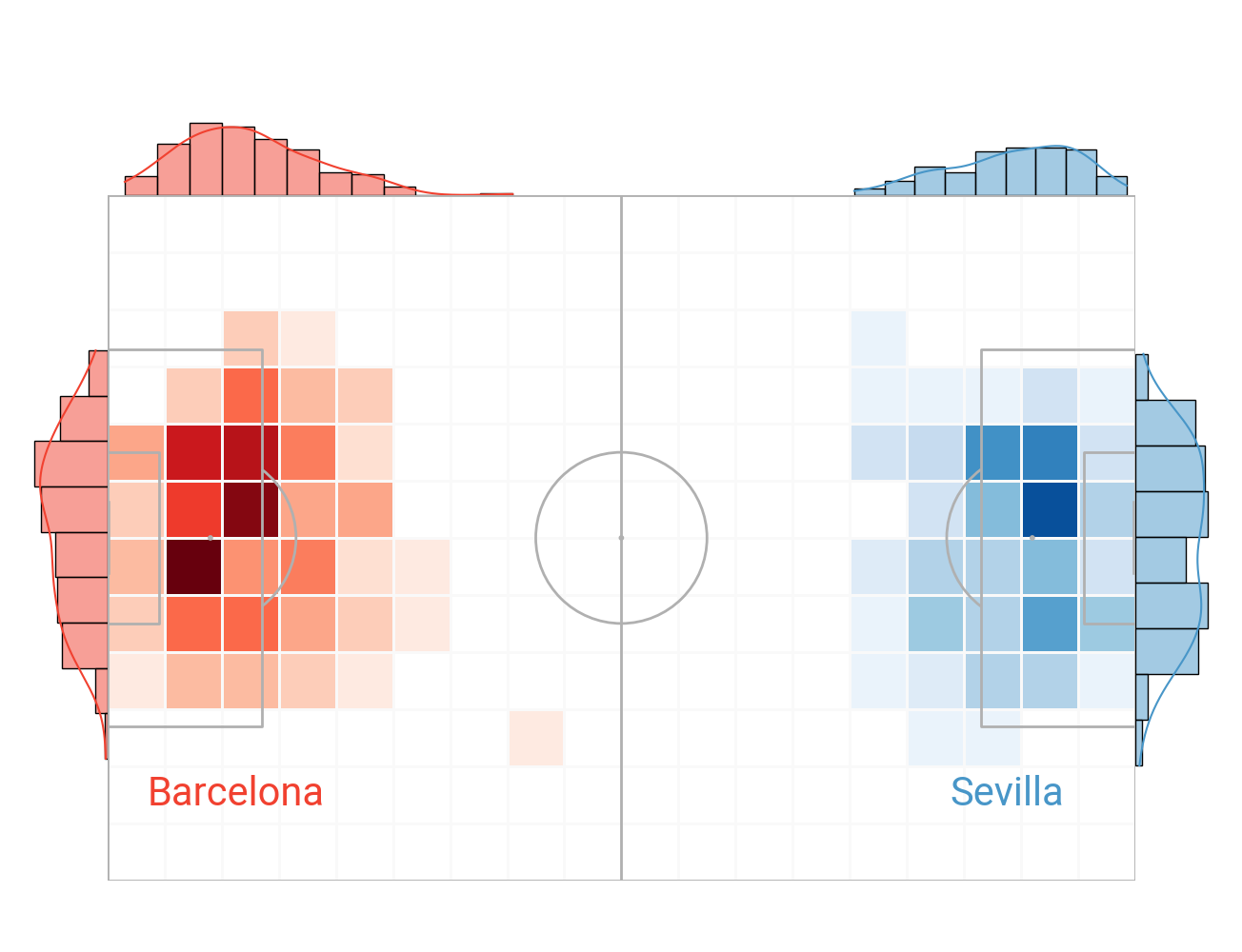
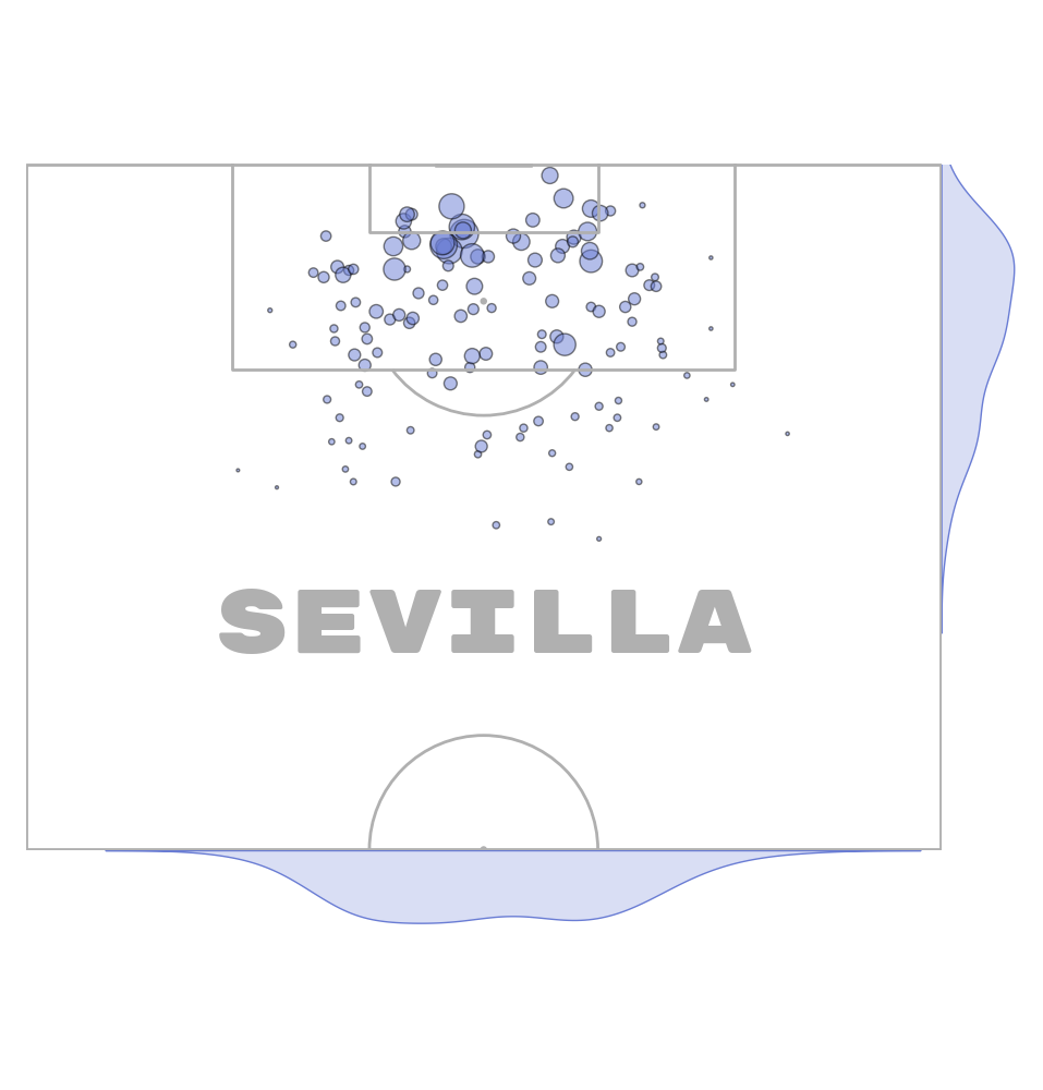
Heatmap shot map with histogram/ kdeplot on the marginal axes
fig, axs = pitch.jointgrid(figheight=10, left=None, bottom=0.075, grid_height=0.8,
                           axis=False,  # turn off title/ endnote/ marginal axes
                           # plot without endnote/ title axes
                           title_height=0, endnote_height=0)
bs1 = pitch.bin_statistic(df_team1.x, df_team1.y, bins=(18, 12))
bs2 = pitch.bin_statistic(df_team2.x, df_team2.y, bins=(18, 12))
# get the min/ max values for normalizing across both teams
vmax = max(bs2['statistic'].max(), bs1['statistic'].max())
vmin = max(bs2['statistic'].min(), bs1['statistic'].min())
# set values where zero shots to nan values so it does not show up in the heatmap
# i.e. zero values take the background color
bs1['statistic'][bs1['statistic'] == 0] = np.nan
bs2['statistic'][bs2['statistic'] == 0] = np.nan
# set the vmin/ vmax so the colors depend on the minimum/maximum value for both teams
hm1 = pitch.heatmap(bs1, ax=axs['pitch'], cmap='Reds', vmin=vmin, vmax=vmax, edgecolor='#f9f9f9')
hm2 = pitch.heatmap(bs2, ax=axs['pitch'], cmap='Blues', vmin=vmin, vmax=vmax, edgecolor='#f9f9f9')
# histograms with kdeplot
team1_hist_y = sns.histplot(y=df_team1.y, ax=axs['left'], color=red, linewidth=1, kde=True)
team1_hist_x = sns.histplot(x=df_team1.x, ax=axs['top'], color=red, linewidth=1, kde=True)
team2_hist_x = sns.histplot(x=df_team2.x, ax=axs['top'], color=blue, linewidth=1, kde=True)
team2_hist_y = sns.histplot(y=df_team2.y, ax=axs['right'], color=blue, linewidth=1, kde=True)
txt1 = axs['pitch'].text(x=15, y=70, s=team1, fontproperties=fm.prop, color=red,
                         ha='center', va='center', fontsize=30)
txt2 = axs['pitch'].text(x=105, y=70, s=team2, fontproperties=fm.prop, color=blue,
                         ha='center', va='center', fontsize=30)
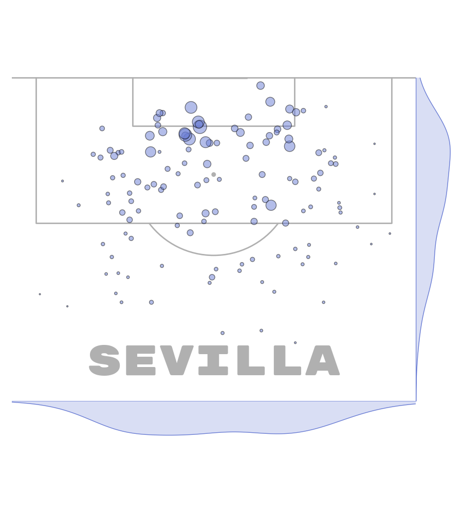
Kdeplot shot map with kdeplot on the marginal axes
fig, axs = pitch.jointgrid(figheight=10, left=None, bottom=0.075, grid_height=0.8,
                           axis=False,  # turn off title/ endnote/ marginal axes
                           # plot without endnote/ title axes
                           title_height=0, endnote_height=0)
# increase number of levels for a smoother looking heatmap
kde1 = pitch.kdeplot(df_team1.x, df_team1.y, ax=axs['pitch'], cmap='Reds', levels=75, fill=True)
kde2 = pitch.kdeplot(df_team2.x, df_team2.y, ax=axs['pitch'], cmap='Blues', levels=75, fill=True)
# kdeplot on marginal axes
team1_hist_y = sns.kdeplot(y=df_team1.y, ax=axs['left'], color=red, fill=True)
team1_hist_x = sns.kdeplot(x=df_team1.x, ax=axs['top'], color=red, fill=True)
team2_hist_x = sns.kdeplot(x=df_team2.x, ax=axs['top'], color=blue, fill=True)
team2_hist_y = sns.kdeplot(y=df_team2.y, ax=axs['right'], color=blue, fill=True)
txt1 = axs['pitch'].text(x=15, y=70, s=team1, fontproperties=fm.prop, color=red,
                         ha='center', va='center', fontsize=30)
txt2 = axs['pitch'].text(x=105, y=70, s=team2, fontproperties=fm.prop, color=blue,
                         ha='center', va='center', fontsize=30)
Vertical shot map with kdeplot marginals
The jointgrid is flexible. You can filter the marginal axes with ax_left, ax_top, ax_left, ax_right. Here we set the bottom and right marginal axes to display for a single team.
fig, axs = vertical_pitch.jointgrid(figheight=10, left=None, bottom=0.15,
                                    grid_height=0.7, marginal=0.1,
                                    # plot without endnote/ title axes
                                    endnote_height=0, title_height=0,
                                    axis=False,  # turn off title/ endnote/ marginal axes
                                    # here we filter out the left and top marginal axes
                                    ax_top=False, ax_bottom=True,
                                    ax_left=False, ax_right=True)
# typical shot map where the scatter points vary by the expected goals value
# using alpha for transparency as there are a lot of shots stacked around the six-yard box
sc_team2 = vertical_pitch.scatter(df_team2.x, df_team2.y, s=df_team2.shot_statsbomb_xg * 700,
                                  alpha=0.5, ec='black', color='#697cd4', ax=axs['pitch'])
# kdeplots on the marginals
# remember to flip the coordinates y=x, x=y for the marginals when using vertical orientation
team2_hist_x = sns.kdeplot(y=df_team2.x, ax=axs['right'], color='#697cd4', fill=True)
team2_hist_y = sns.kdeplot(x=df_team2.y, ax=axs['bottom'], color='#697cd4', fill=True)
txt1 = axs['pitch'].text(x=40, y=80, s=team2, fontproperties=fm_rubik.prop, color=pitch.line_color,
                         ha='center', va='center', fontsize=60)
Crop the pitch
The jointgrid also works with arbritary padding. So you can crop the pitc and still have the marginal axes to plot on.
vertical_pitch = VerticalPitch(half=True,
                               # here we remove some of the pitch on the left/ right/ bottom
                               pad_top=0.05, pad_right=-15, pad_bottom=-20, pad_left=-15,
                               goal_type='line')

fig, axs = vertical_pitch.jointgrid(figheight=10, left=None, bottom=0.15,
                                    grid_height=0.7, marginal=0.1,
                                    # plot without an endnote/ title axes
                                    title_height=0, endnote_height=0,
                                    axis=False,  # turn off title/ endnote/ marginal axes
                                    # here we filter out the left and top marginal axes
                                    ax_top=False, ax_bottom=True,
                                    ax_left=False, ax_right=True)
# typical shot map where the scatter points vary by the expected goals value
# using alpha for transparency as there are a lot of shots stacked around the six-yard box
sc_team2 = vertical_pitch.scatter(df_team2.x, df_team2.y, s=df_team2.shot_statsbomb_xg * 700,
                                  alpha=0.5, ec='black', color='#697cd4', ax=axs['pitch'])
# kdeplots on the marginals
# remember to flip the coordinates y=x, x=y for the marginals when using vertical orientation
team2_hist_x = sns.kdeplot(y=df_team2.x, ax=axs['right'], color='#697cd4', fill=True)
team2_hist_y = sns.kdeplot(x=df_team2.y, ax=axs['bottom'], color='#697cd4', fill=True)
txt1 = axs['pitch'].text(x=40, y=85, s=team2, fontproperties=fm_rubik.prop, color=pitch.line_color,
                         ha='center', va='center', fontsize=60)
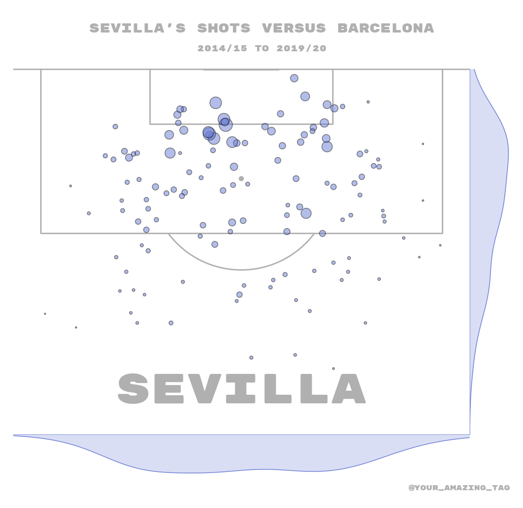
Add a title and endnote
The jointgrid also has an option to plot an endnote and a title axes.
vertical_pitch = VerticalPitch(half=True,
                               # here we remove some of the pitch on the left/ right/ bottom
                               pad_top=0.05, pad_right=-15, pad_bottom=-20, pad_left=-15,
                               goal_type='line')

fig, axs = vertical_pitch.jointgrid(figheight=10, left=None, bottom=None,  # center aligned
                                    grid_width=0.95, marginal=0.1,
                                    # setting up the heights/space so it takes up 95% of the figure
                                    grid_height=0.80,
                                    title_height=0.1, endnote_height=0.03,
                                    title_space=0.01, endnote_space=0.01,
                                    axis=False,  # turn off title/ endnote/ marginal axes
                                    # here we filter out the left and top marginal axes
                                    ax_top=False, ax_bottom=True,
                                    ax_left=False, ax_right=True)
# typical shot map where the scatter points vary by the expected goals value
# using alpha for transparency as there are a lot of shots stacked around the six-yard box
sc_team2 = vertical_pitch.scatter(df_team2.x, df_team2.y, s=df_team2.shot_statsbomb_xg * 700,
                                  alpha=0.5, ec='black', color='#697cd4', ax=axs['pitch'])
# kdeplots on the marginals
# remember to flip the coordinates y=x, x=y for the marginals when using vertical orientation
team2_hist_x = sns.kdeplot(y=df_team2.x, ax=axs['right'], color='#697cd4', fill=True)
team2_hist_y = sns.kdeplot(x=df_team2.y, ax=axs['bottom'], color='#697cd4', fill=True)
txt1 = axs['pitch'].text(x=40, y=85, s=team2, fontproperties=fm_rubik.prop, color=pitch.line_color,
                         ha='center', va='center', fontsize=60)

# titles and endnote
axs['title'].text(0.5, 0.7, "Sevilla's shots versus Barcelona", color=pitch.line_color,
                  fontproperties=fm_rubik.prop, fontsize=18, ha='center', va='center')
axs['title'].text(0.5, 0.3, "2014/15 to 2019/20", color=pitch.line_color,
                  fontproperties=fm_rubik.prop, fontsize=12, ha='center', va='center')
axs['endnote'].text(1, 0.5, '@your_amazing_tag', ha='right', va='center',
                    color=pitch.line_color, fontproperties=fm_rubik.prop)

plt.show()  # If you are using a Jupyter notebook you do not need this line
Total running time of the script: (0 minutes 9.974 seconds)