Note
Go to the end to download the full example code.
Heatmap
This example shows how to plot all pressure events from three matches as a heatmap.
import matplotlib.patheffects as path_effects
import matplotlib.pyplot as plt
import numpy as np
import pandas as pd
from matplotlib.colors import LinearSegmentedColormap
from scipy.ndimage import gaussian_filter

from mplsoccer import Pitch, VerticalPitch, FontManager, Sbopen

# get data
parser = Sbopen()
match_files = [19789, 19794, 19805]
df = pd.concat([parser.event(file)[0] for file in match_files])  # 0 index is the event file

# filter chelsea pressure and pass events
mask_chelsea_pressure = (df.team_name == 'Chelsea FCW') & (df.type_name == 'Pressure')
df_pressure = df.loc[mask_chelsea_pressure, ['x', 'y']]
mask_chelsea_pressure = (df.team_name == 'Chelsea FCW') & (df.type_name == 'Pass')
df_pass = df.loc[mask_chelsea_pressure, ['x', 'y', 'end_x', 'end_y']]
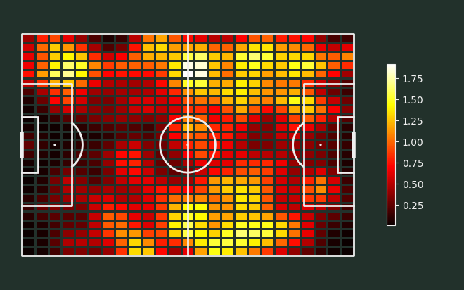
Plot a gaussian smoothed heatmap
# Tom Decroos, author of `matplotsoccer <https://github.com/TomDecroos/matplotsoccer>`_,
# asked whether it was possible to plot a Gaussian smoothed heatmap,
# which are available in matplotsoccer. Here is an example demonstrating this.

# setup pitch
pitch = Pitch(pitch_type='statsbomb', line_zorder=2,
              pitch_color='#22312b', line_color='#efefef')
# draw
fig, ax = pitch.draw(figsize=(6.6, 4.125))
fig.set_facecolor('#22312b')
bin_statistic = pitch.bin_statistic(df_pressure.x, df_pressure.y, statistic='count', bins=(25, 25))
bin_statistic['statistic'] = gaussian_filter(bin_statistic['statistic'], 1)
pcm = pitch.heatmap(bin_statistic, ax=ax, cmap='hot', edgecolors='#22312b')
# Add the colorbar and format off-white
cbar = fig.colorbar(pcm, ax=ax, shrink=0.6)
cbar.outline.set_edgecolor('#efefef')
cbar.ax.yaxis.set_tick_params(color='#efefef')
ticks = plt.setp(plt.getp(cbar.ax.axes, 'yticklabels'), color='#efefef')
Load some fonts, path effects, and a custom colormap
# fontmanager for google font (robotto)
robotto_regular = FontManager()

# path effects
path_eff = [path_effects.Stroke(linewidth=1.5, foreground='black'),
            path_effects.Normal()]

# see the custom colormaps example for more ideas on setting colormaps
pearl_earring_cmap = LinearSegmentedColormap.from_list("Pearl Earring - 10 colors",
                                                       ['#15242e', '#4393c4'], N=10)
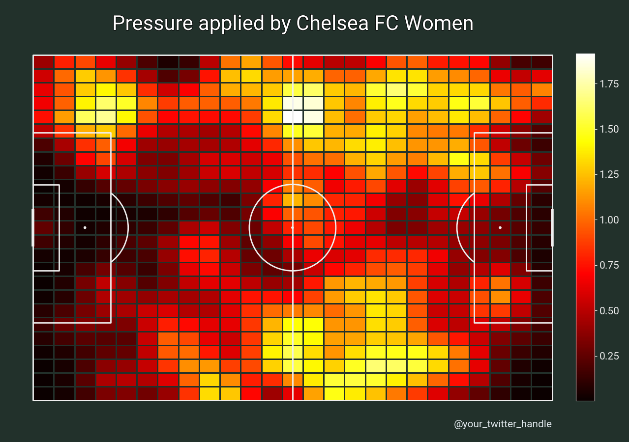
Plot the chart again with a title
We will use mplsoccer’s grid function to plot a pitch with a title and endnote axes.
fig, axs = pitch.grid(endnote_height=0.03, endnote_space=0,
                      # leave some space for the colorbar
                      grid_width=0.88, left=0.025,
                      title_height=0.06, title_space=0,
                      # Turn off the endnote/title axis. I usually do this after
                      # I am happy with the chart layout and text placement
                      axis=False,
                      grid_height=0.86)
fig.set_facecolor('#22312b')

# plot heatmap
bin_statistic = pitch.bin_statistic(df_pressure.x, df_pressure.y, statistic='count', bins=(25, 25))
bin_statistic['statistic'] = gaussian_filter(bin_statistic['statistic'], 1)
pcm = pitch.heatmap(bin_statistic, ax=axs['pitch'], cmap='hot', edgecolors='#22312b')

# add cbar
ax_cbar = fig.add_axes((0.915, 0.093, 0.03, 0.786))
cbar = plt.colorbar(pcm, cax=ax_cbar)
cbar.outline.set_edgecolor('#efefef')
cbar.ax.yaxis.set_tick_params(color='#efefef')
plt.setp(plt.getp(cbar.ax.axes, 'yticklabels'), color='#efefef')
for label in cbar.ax.get_yticklabels():
    label.set_fontproperties(robotto_regular.prop)
    label.set_fontsize(15)

# endnote and title
axs['endnote'].text(1, 0.5, '@your_twitter_handle', va='center', ha='right', fontsize=15,
                    fontproperties=robotto_regular.prop, color='#dee6ea')
ax_title = axs['title'].text(0.5, 0.5, "Pressure applied by Chelsea FC Women", color='white',
                             va='center', ha='center', path_effects=path_eff,
                             fontproperties=robotto_regular.prop, fontsize=30)
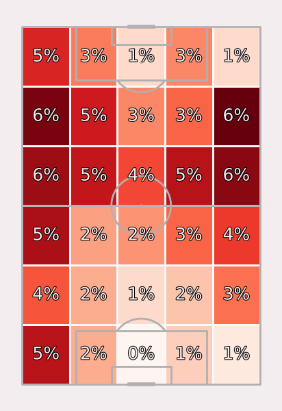
Plot heatmap with larger cells
Here is another example plotting heatmaps with larger bins (6 across by 5 down) with no smoothing.
pitch = VerticalPitch(pitch_type='statsbomb', line_zorder=2, pitch_color='#f4edf0')
fig, ax = pitch.draw(figsize=(4.125, 6))
fig.set_facecolor('#f4edf0')
bin_statistic = pitch.bin_statistic(df_pressure.x, df_pressure.y, statistic='count', bins=(6, 5), normalize=True)
pitch.heatmap(bin_statistic, ax=ax, cmap='Reds', edgecolor='#f9f9f9')
labels = pitch.label_heatmap(bin_statistic, color='#f4edf0', fontsize=18,
                             ax=ax, ha='center', va='center',
                             str_format='{:.0%}', path_effects=path_eff)
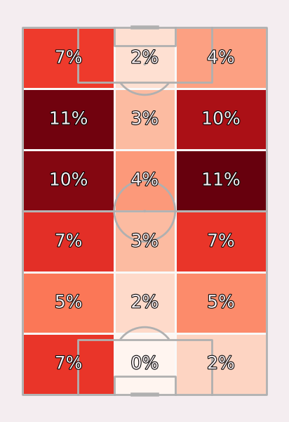
Plot heatmap with defined bins
Here is another example, which use pitch locations instead of a tuple for the bins. We will create a heatmap for zone 14,
pitch = VerticalPitch(pitch_type='statsbomb', line_zorder=2, pitch_color='#f4edf0')
fig, ax = pitch.draw(figsize=(4.125, 6))
fig.set_facecolor('#f4edf0')
bin_x = np.linspace(pitch.dim.left, pitch.dim.right, num=7)
bin_y = np.sort(np.array([pitch.dim.bottom, pitch.dim.six_yard_bottom,
                          pitch.dim.six_yard_top, pitch.dim.top]))
bin_statistic = pitch.bin_statistic(df_pressure.x, df_pressure.y, statistic='count',
                                    bins=(bin_x, bin_y), normalize=True)
pitch.heatmap(bin_statistic, ax=ax, cmap='Reds', edgecolor='#f9f9f9')
labels2 = pitch.label_heatmap(bin_statistic, color='#f4edf0', fontsize=18,
                              ax=ax, ha='center', va='center',
                              str_format='{:.0%}', path_effects=path_eff)
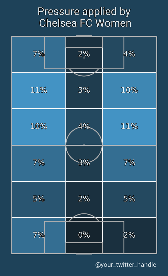
Plot the chart again with a title
We will use mplsoccer’s grid function to plot a pitch with a title and endnote axes.
pitch = VerticalPitch(pitch_type='statsbomb', line_zorder=2, pitch_color='#1e4259')
fig, axs = pitch.grid(endnote_height=0.03, endnote_space=0,
                      title_height=0.08, title_space=0,
                      # Turn off the endnote/title axis. I usually do this after
                      # I am happy with the chart layout and text placement
                      axis=False,
                      grid_height=0.84)
fig.set_facecolor('#1e4259')

bin_x = np.linspace(pitch.dim.left, pitch.dim.right, num=7)
bin_y = np.sort(np.array([pitch.dim.bottom, pitch.dim.six_yard_bottom,
                          pitch.dim.six_yard_top, pitch.dim.top]))
bin_statistic = pitch.bin_statistic(df_pressure.x, df_pressure.y, statistic='count',
                                    bins=(bin_x, bin_y), normalize=True)
pitch.heatmap(bin_statistic, ax=axs['pitch'], cmap=pearl_earring_cmap, edgecolor='#f9f9f9')
labels3 = pitch.label_heatmap(bin_statistic, color='#dee6ea', fontsize=18,
                              ax=axs['pitch'], ha='center', va='center',
                              str_format='{:.0%}', path_effects=path_eff)

# endnote and title
endnote_text = axs['endnote'].text(1, 0.5, '@your_twitter_handle',
                                   va='center', ha='right', fontsize=15,
                                   fontproperties=robotto_regular.prop, color='#dee6ea')
title_text = axs['title'].text(0.5, 0.5, "Pressure applied by\n Chelsea FC Women",
                               color='#dee6ea', va='center', ha='center', path_effects=path_eff,
                               fontproperties=robotto_regular.prop, fontsize=25)
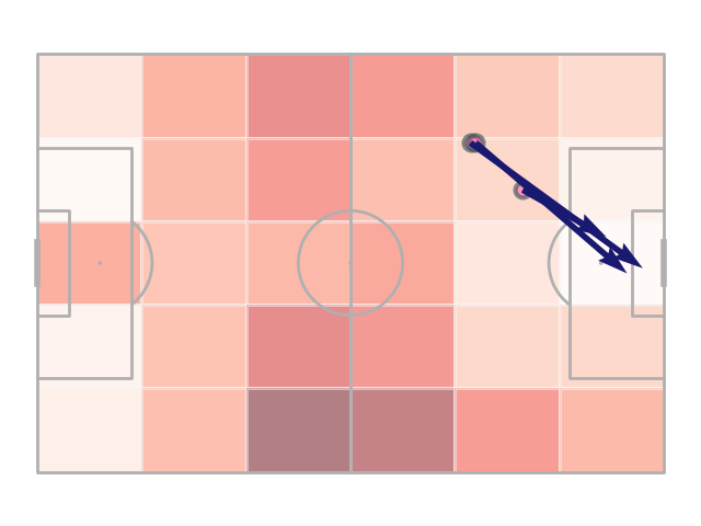
Get bin numbers
We can also use the bin_statistic method to get the binnumbers. For example, to identify which cell each pass or pressure event was located in. In this example, we use bin_statistic to get both the start and end location cells for the passes. We then identify passes that began in one cell and ended in another cell close to the goal. Note that the bin numbers are zero indexed so the first cell on the left is zero and the first cell at the bottom is zero. Any event that happened outside the pitch for a dimension is given the value -1.
pitch = Pitch(line_zorder=2)
fig, ax = pitch.draw()
bin_statistic = pitch.bin_statistic(df_pass.x, df_pass.y, bins=(6, 5))
bin_statistic_end = pitch.bin_statistic(df_pass.end_x, df_pass.end_y, bins=(6, 5))

# let's get a mask for all passes that started in one grid cell and ended in another
mask_start = np.logical_and(bin_statistic['binnumber'][0] == 4,  # xs 5th box from left (zero indexed)
                            bin_statistic['binnumber'][1] == 1)  # ys 2nd from bottom (zero indexed)
mask_end = np.logical_and(bin_statistic_end['binnumber'][0] == 5,  # xs 6th box from left (zero indexed)
                          bin_statistic_end['binnumber'][1] == 2)  # ys 3rd box from bottom (zero indexed)
mask = np.logical_and(mask_start, mask_end)

# plot the passes that started in one grid cell and ended in another
pitch.scatter(df_pass.x[mask], df_pass.y[mask], ax=ax, fc='hotpink',
              marker='o', s=100, ec='darkslategrey', lw=3, alpha=0.6, zorder=4)
pitch.arrows(df_pass.x[mask], df_pass.y[mask], df_pass.end_x[mask], df_pass.end_y[mask],
             ax=ax, zorder=10, color='midnightblue')

# plot all of the starting locations as a heatmap
pitch.heatmap(bin_statistic, ax=ax, cmap='Reds', edgecolor='#f9f9f9', alpha=0.5)

plt.show()  # If you are using a Jupyter notebook you do not need this line
Total running time of the script: (0 minutes 1.381 seconds)