Note
Go to the end to download the full example code.
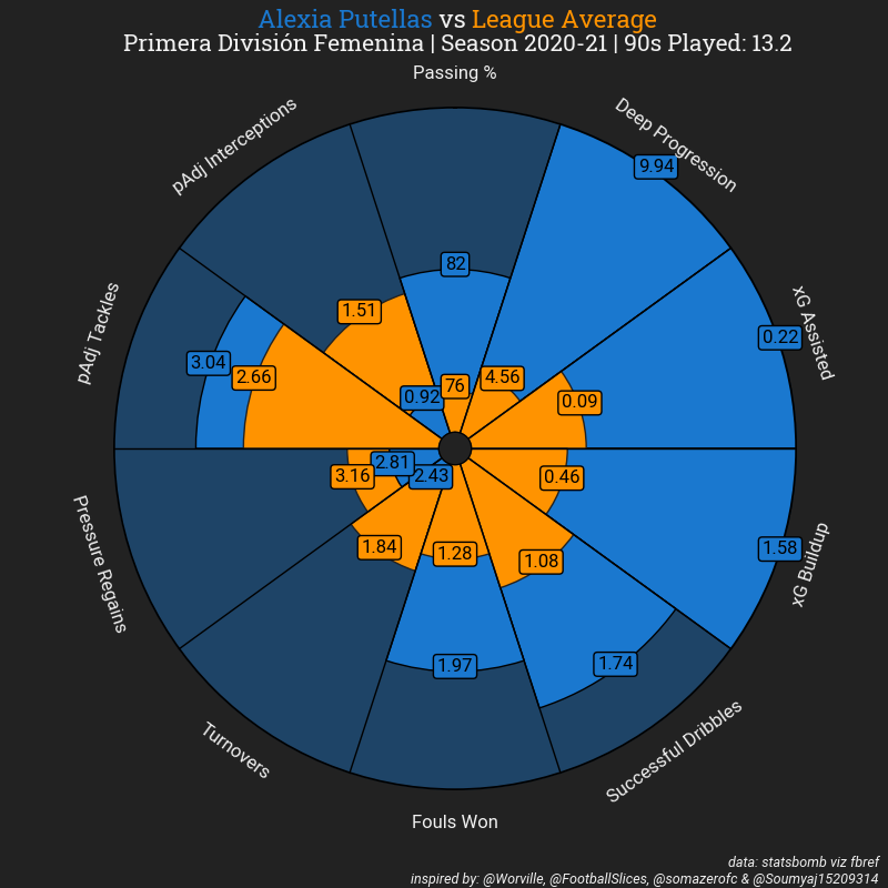
Comparison Pizza (scales vary)
Author: slothfulwave612
mplsoccer,py_pizzamodule helps one to plot pizza charts in a few lines of code.The design idea is inspired by Tom Worville, Football Slices and Soma Zero FC
We have re-written Soumyajit Bose’s pizza chart code to enable greater customisation.
Here we plot a pizza chart for comparing two players where the parameters have a different maximum and minimum value.
import matplotlib.pyplot as plt
from highlight_text import fig_text

from mplsoccer import PyPizza, FontManager
Load some fonts
We will use mplsoccer’s FontManager to load some fonts from Google Fonts. We borrowed the FontManager from the excellent ridge_map library.
font_normal = FontManager('https://raw.githubusercontent.com/googlefonts/roboto/main/'
                          'src/hinted/Roboto-Regular.ttf')
font_italic = FontManager('https://raw.githubusercontent.com/googlefonts/roboto/main/'
                          'src/hinted/Roboto-Italic.ttf')
font_bold = FontManager('https://raw.githubusercontent.com/google/fonts/main/apache/robotoslab/'
                        'RobotoSlab[wght].ttf')
Comparison Chart With Different Scales
To plot comparison chart one have to pass list of values to compare_values argument.
Here we also supply a min_range and max_range for each parameter so
that the scale varies for each parameter.
# parameter and value list
# The values are taken from the excellent fbref website (supplied by StatsBomb)
params = [
    "Passing %", "Deep Progression", "xG Assisted", "xG Buildup",
    "Successful Dribbles", "Fouls Won", "Turnovers", "Pressure Regains",
    "pAdj Tackles", "pAdj Interceptions"
]
values = [82, 9.94, 0.22, 1.58, 1.74, 1.97, 2.43, 2.81, 3.04, 0.92]    # Putellas
values_2 = [76, 4.56, 0.09, 0.46, 1.08, 1.28, 1.84, 3.16, 2.66, 1.51]  # League Average

# minimum range value and maximum range value for parameters
min_range = [74, 3.3, 0.03, 0.28, 0.4, 0.7, 2.6, 2.4, 1.1, 0.7]
max_range = [90, 9.7, 0.20, 0.89, 2.1, 2.7, 0.4, 5.1, 3.7, 2.5]

# instantiate PyPizza class
baker = PyPizza(
    params=params,
    min_range=min_range,        # min range values
    max_range=max_range,        # max range values
    background_color="#222222", straight_line_color="#000000",
    last_circle_color="#000000", last_circle_lw=2.5, other_circle_lw=0,
    other_circle_color="#000000", straight_line_lw=1
)

# plot pizza
fig, ax = baker.make_pizza(
    values,                     # list of values
    compare_values=values_2,    # passing comparison values
    figsize=(8, 8),             # adjust figsize according to your need
    color_blank_space="same",   # use same color to fill blank space
    blank_alpha=0.4,            # alpha for blank-space colors
    param_location=110,         # where the parameters will be added
    kwargs_slices=dict(
        facecolor="#1A78CF", edgecolor="#000000",
        zorder=1, linewidth=1
    ),                          # values to be used when plotting slices
    kwargs_compare=dict(
        facecolor="#ff9300", edgecolor="#222222", zorder=3, linewidth=1,
    ),                          # values to be used when plotting comparison slices
    kwargs_params=dict(
        color="#F2F2F2", fontsize=12, zorder=5,
        fontproperties=font_normal.prop, va="center"
    ),                          # values to be used when adding parameter
    kwargs_values=dict(
        color="#000000", fontsize=12,
        fontproperties=font_normal.prop, zorder=3,
        bbox=dict(
            edgecolor="#000000", facecolor="#1A78CF",
            boxstyle="round,pad=0.2", lw=1
        )
    ),                           # values to be used when adding parameter-values
    kwargs_compare_values=dict(
        color="#000000", fontsize=12,
        fontproperties=font_normal.prop, zorder=3,
        bbox=dict(
            edgecolor="#000000", facecolor="#FF9300",
            boxstyle="round,pad=0.2", lw=1
        )
    )                            # values to be used when adding comparison-values
)

# add title
fig_text(
    0.515, 0.99, "<Alexia Putellas> vs <League Average>",
    size=16, fig=fig,
    highlight_textprops=[{"color": '#1A78CF'}, {"color": '#FF9300'}],
    ha="center", fontproperties=font_bold.prop, color="#F2F2F2"
)

# add subtitle
fig.text(
    0.515, 0.942,
    "Primera División Femenina | Season 2020-21 | 90s Played: 13.2",
    size=15,
    ha="center", fontproperties=font_bold.prop, color="#F2F2F2"
)

# add credits
CREDIT_1 = "data: statsbomb viz fbref"
CREDIT_2 = "inspired by: @Worville, @FootballSlices, @somazerofc & @Soumyaj15209314"

fig.text(
    0.99, 0.005, f"{CREDIT_1}\n{CREDIT_2}", size=9,
    fontproperties=font_italic.prop, color="#F2F2F2",
    ha="right"
)

plt.show()
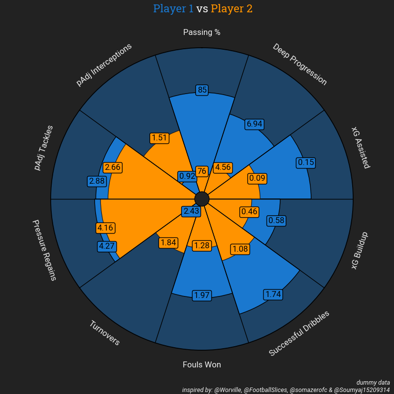
Adjust Overlapping Values
To adjust overlapping values one can use adjust_texts() method.
The user have to pass params_offset list which will contain bool values denoting
which parameter’s text is to be adjusted, an offset value denoting
how much adjustment will be made, and if the user wants to adjust
the comparison-text then can pass adj_comp_values=True to the adjust_texts() method.
Below is an example code.
# parameter and values list
params = [
    "Passing %", "Deep Progression", "xG Assisted", "xG Buildup",
    "Successful Dribbles", "Fouls Won", "Turnovers", "Pressure Regains",
    "pAdj Tackles", "pAdj Interceptions"
]
values = [85, 6.94, 0.15, 0.58, 1.74, 1.97, 2.43, 4.27, 2.88, 0.92]    # player 1
values_2 = [76, 4.56, 0.09, 0.46, 1.08, 1.28, 1.84, 4.16, 2.66, 1.51]  # player 2

# minimum range value and maximum range value for parameters
min_range = [74, 3.3, 0.03, 0.28, 0.4, 0.7, 2.6, 2.4, 1.1, 0.7]
max_range = [90, 9.7, 0.20, 0.89, 2.1, 2.7, 0.4, 5.1, 3.7, 2.5]

# pass True in that parameter-index whose values are to be adjusted
# here True values are passed for "Pressure Regains", "pAdj Tackles" params
params_offset = [
    False, False, False, False, False,
    False, False, True, True, False
]

# instantiate PyPizza class
baker = PyPizza(
    params=params,
    min_range=min_range,        # min range values
    max_range=max_range,        # max range values
    background_color="#222222", straight_line_color="#000000",
    last_circle_color="#000000", last_circle_lw=2.5, other_circle_lw=0,
    other_circle_color="#000000", straight_line_lw=1
)

# plot pizza
fig, ax = baker.make_pizza(
    values,                     # list of values
    compare_values=values_2,    # passing comparison values
    figsize=(8, 8),             # adjust figsize according to your need
    color_blank_space="same",   # use same color to fill blank space
    blank_alpha=0.4,            # alpha for blank-space colors
    param_location=110,         # where the parameters will be added
    kwargs_slices=dict(
        facecolor="#1A78CF", edgecolor="#000000",
        zorder=1, linewidth=1
    ),                          # values to be used when plotting slices
    kwargs_compare=dict(
        facecolor="#ff9300", edgecolor="#222222", zorder=3, linewidth=1,
    ),                          # values to be used when plotting comparison slices
    kwargs_params=dict(
        color="#F2F2F2", fontsize=12, zorder=5,
        fontproperties=font_normal.prop, va="center"
    ),                          # values to be used when adding parameter
    kwargs_values=dict(
        color="#000000", fontsize=12,
        fontproperties=font_normal.prop, zorder=3,
        bbox=dict(
            edgecolor="#000000", facecolor="#1A78CF",
            boxstyle="round,pad=0.2", lw=1
        )
    ),                           # values to be used when adding parameter-values
    kwargs_compare_values=dict(
        color="#000000", fontsize=12,
        fontproperties=font_normal.prop, zorder=3,
        bbox=dict(
            edgecolor="#000000", facecolor="#FF9300",
            boxstyle="round,pad=0.2", lw=1
        )
    )                            # values to be used when adding comparison-values
)


# adjust the texts
# to adjust text for comparison-values-text pass adj_comp_values=True
baker.adjust_texts(params_offset, offset=-0.17)

# add title
fig_text(
    0.515, 0.99, "<Player 1> vs <Player 2>",
    size=16, fig=fig,
    highlight_textprops=[{"color": '#1A78CF'}, {"color": '#FF9300'}],
    ha="center", fontproperties=font_bold.prop, color="#F2F2F2"
)

# add credits
CREDIT_1 = "dummy data"
CREDIT_2 = "inspired by: @Worville, @FootballSlices, @somazerofc & @Soumyaj15209314"

fig.text(
    0.99, 0.005, f"{CREDIT_1}\n{CREDIT_2}", size=9,
    fontproperties=font_italic.prop, color="#F2F2F2",
    ha="right"
)

plt.show()
Total running time of the script: (0 minutes 0.343 seconds)